All Tips


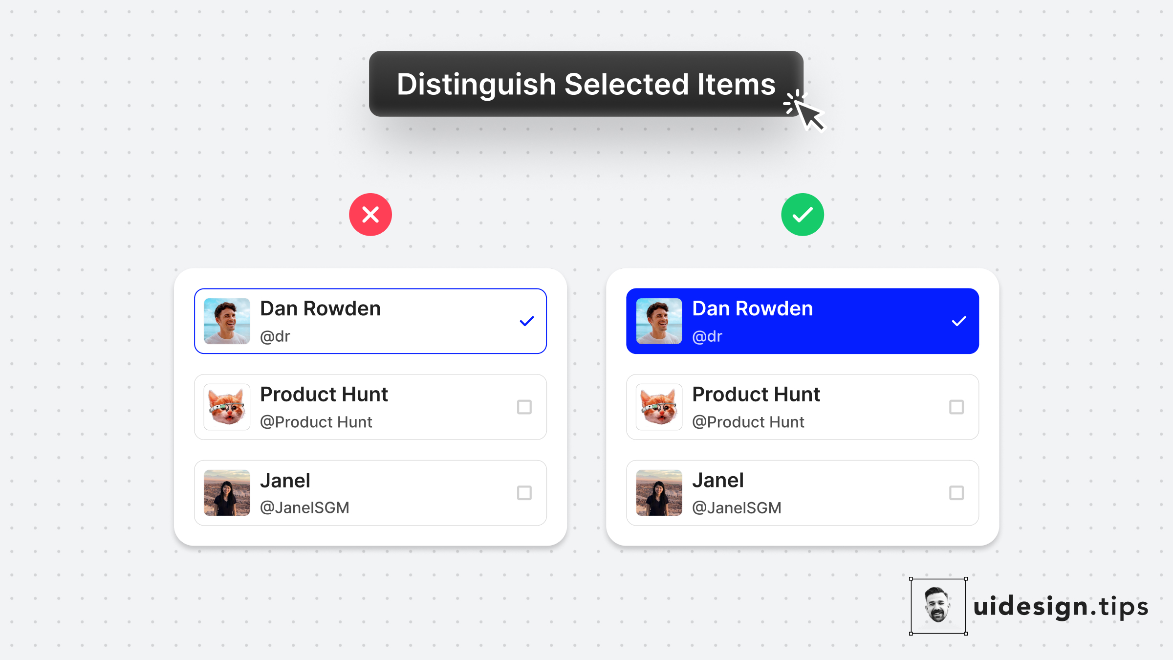
Distinguish Selected Items
ux
ui
visual effect
hierarchy
Always make sure that your selected items are easily identified at a glance.
Changing the background color is a simple and accessible way to achieve it!
It makes the user experience better since the user can easily figure out which elements are already selected.

Become a Better Designer.
The Fun way.
Join 100s of developers, entrepreneurs & junior designers who strive to become better in UI & UX design with byte-sized, practical tips & examples!
Get notified about new tips & articles before anyone else!
"
I love these little tips. It’s like Dribbble but actually useful.
Martin LeBlanc
CEO of Iconfinder
"
I love UX & UI tips. Especially, when they are practical and presented in a very good way. Yours are meeting both criteria.
Lisa Dziuba
Head of Marketing at Abstract


