All Tips

Use Consistent Buttons
button
cta
ux
ui
conversions
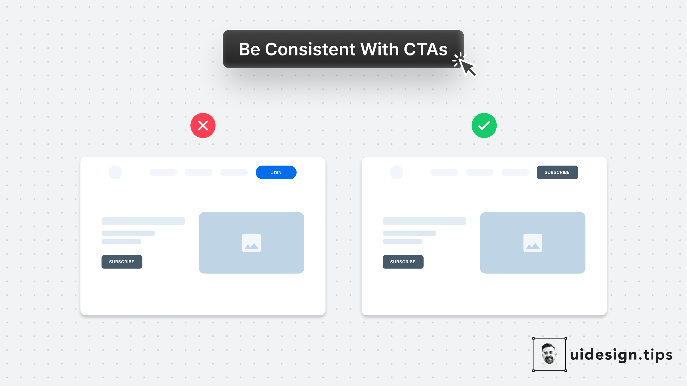
Your design, and mostly your buttons, need to be consistent thought the user interface.
Keep this in mind especially for the header (hero) section.
Don't confuse your visitors with different buttons in styles and copy.
For almost all cases, you only need a single primary CTA for your top screen.

Become a Better Designer.
The Fun way.
Join 100s of developers, entrepreneurs & junior designers who strive to become better in UI & UX design with byte-sized, practical tips & examples!
Get notified about new tips & articles before anyone else!
"
I love these little tips. It’s like Dribbble but actually useful.
Martin LeBlanc
CEO of Iconfinder
"
I love UX & UI tips. Especially, when they are practical and presented in a very good way. Yours are meeting both criteria.
Lisa Dziuba
Head of Marketing at Abstract
