All Tips


Prioritize UX
conversions
ux
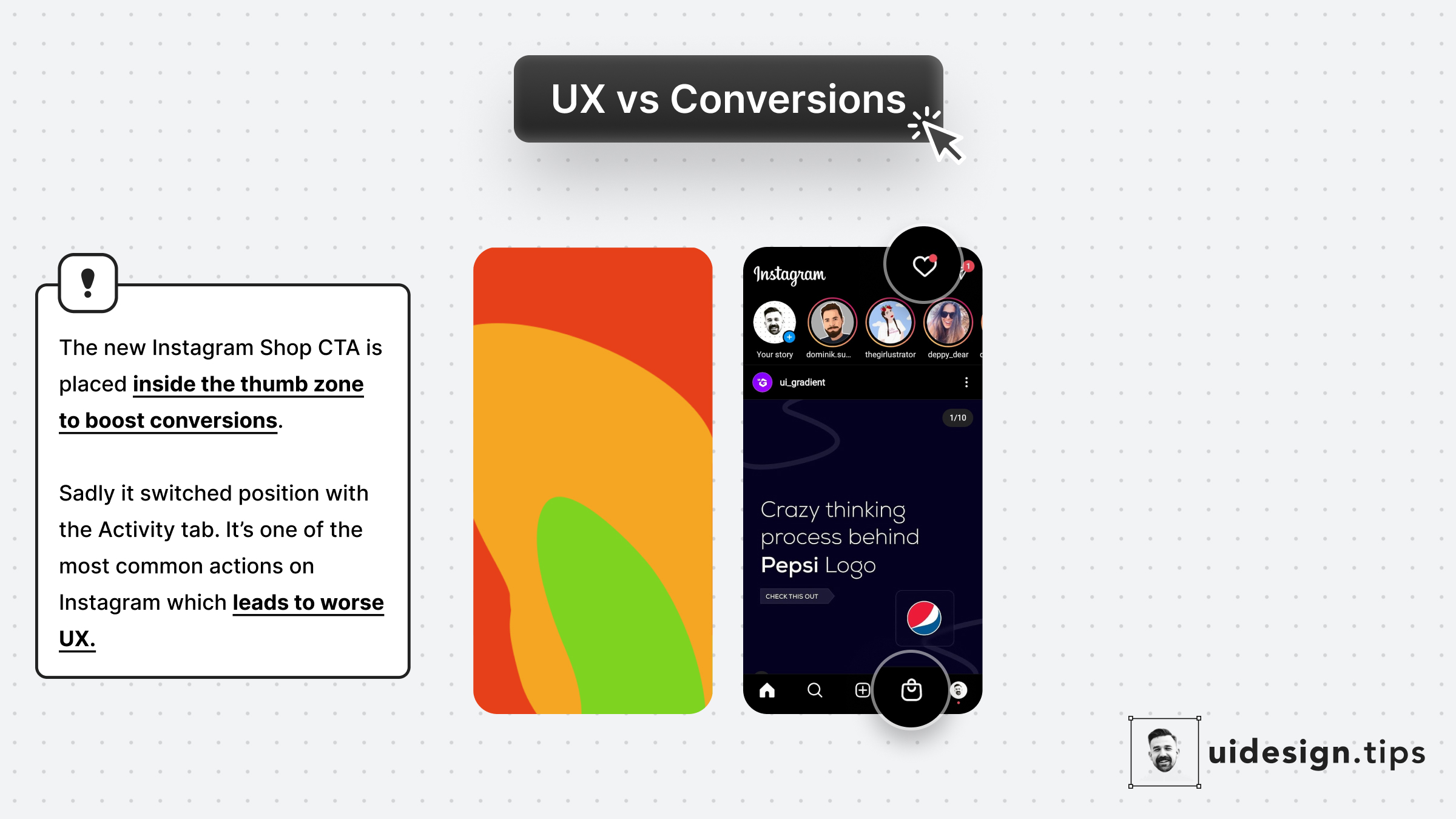
Instagram recently launched Shop.
The decision to place it at the position of the Activity tab is not random...
- More reachable since it's in the Thumb Zone
- More accidental clicks bc users will reach for the activity tab
This might lead to better conversions but make the user experience x10 worse.
10 annoyed users are far worse than an extra customer.

Become a Better Designer.
The Fun way.
Join 100s of developers, entrepreneurs & junior designers who strive to become better in UI & UX design with byte-sized, practical tips & examples!
Get notified about new tips & articles before anyone else!
"
I love these little tips. It’s like Dribbble but actually useful.
Martin LeBlanc
CEO of Iconfinder
"
I love UX & UI tips. Especially, when they are practical and presented in a very good way. Yours are meeting both criteria.
Lisa Dziuba
Head of Marketing at Abstract


