All Tips


Before-After Visuals
ux tips
visuals
value
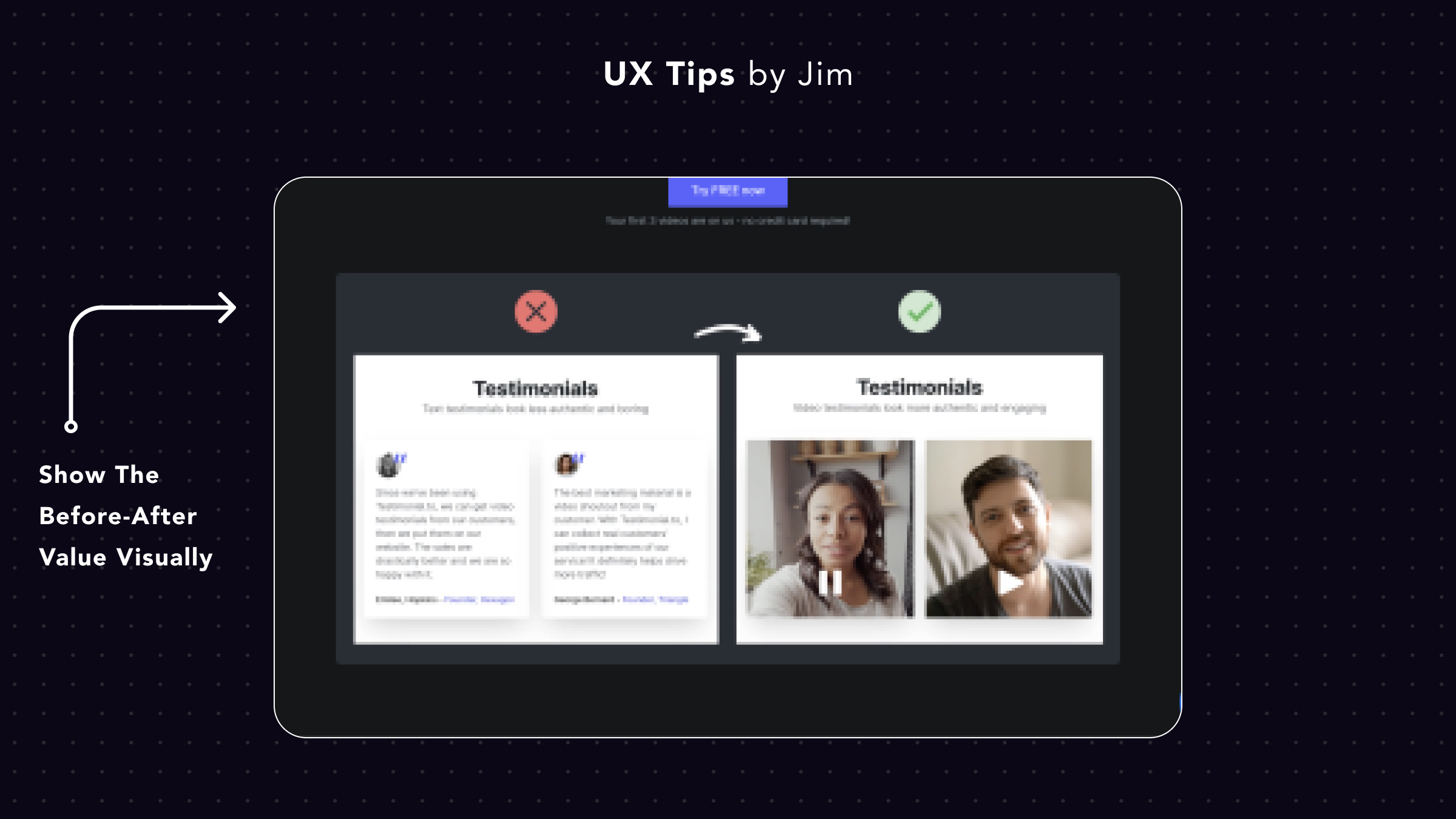
Always try to use before/after visuals for your landing page (if it's applicable).
There are 3 simple steps to create great before/after visuals:
- Identify your core product use case and/or problem you solve
- Show the traditional way people solve the problem now (and make it look full of friction)
- Show your product as the new and better alternative
It's the best way to show people your product's value because they compare visually how your product transforms the life/workflow of your users. Images or videos are always stronger than plain text.

Become a Better Designer.
The Fun way.
Join 100s of developers, entrepreneurs & junior designers who strive to become better in UI & UX design with byte-sized, practical tips & examples!
Get notified about new tips & articles before anyone else!
"
I love these little tips. It’s like Dribbble but actually useful.
Martin LeBlanc
CEO of Iconfinder
"
I love UX & UI tips. Especially, when they are practical and presented in a very good way. Yours are meeting both criteria.
Lisa Dziuba
Head of Marketing at Abstract


