All Tips


CTA Copy Matters
conversions
copy
cta
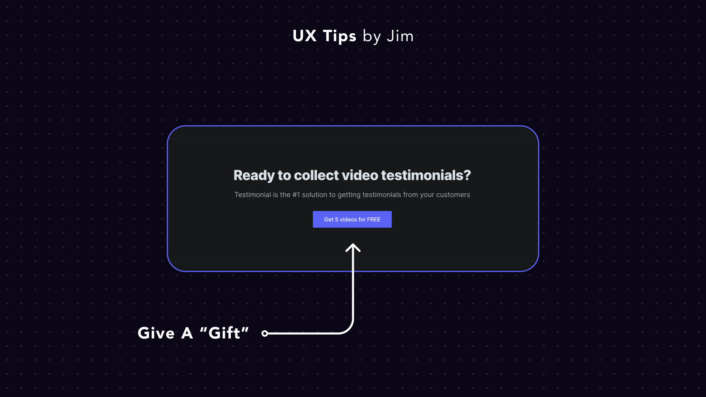
Avoid generic copies for your main CTA buttons.
Instead, use actionable verbs (like "Get", "Start", "Create" etc) and highlight the reason why a user should take the next step (aka convert).
Bonus points if you hint that by going forward they'll receive a "free gift". Normally this free gift is part of your free tier but it makes sense to highlight it since your visitor might not know it yet.

Become a Better Designer.
The Fun way.
Join 100s of developers, entrepreneurs & junior designers who strive to become better in UI & UX design with byte-sized, practical tips & examples!
Get notified about new tips & articles before anyone else!
"
I love these little tips. It’s like Dribbble but actually useful.
Martin LeBlanc
CEO of Iconfinder
"
I love UX & UI tips. Especially, when they are practical and presented in a very good way. Yours are meeting both criteria.
Lisa Dziuba
Head of Marketing at Abstract


