All Tips


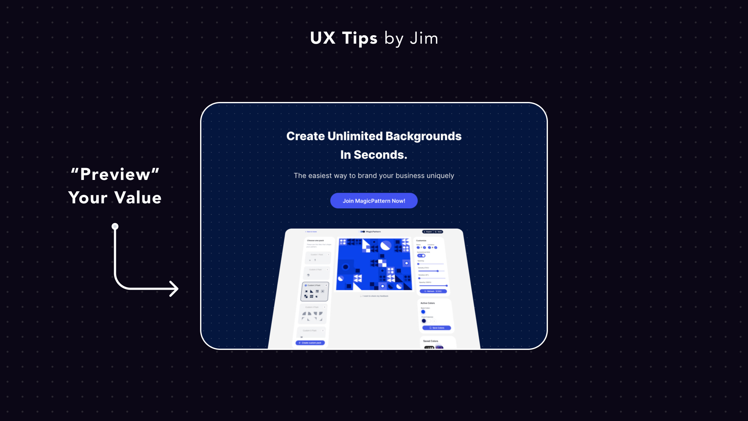
Preview Product's Value near the CTA
cta
visuals
A landing page's CTA section reminds your visitors to subscribe to your service.
Add a preview of your product to entice people to try it. According to the FOMO effect (Fear Of Missing Out) they'll feel left out if they don't use it.

Become a Better Designer.
The Fun way.
Join 100s of developers, entrepreneurs & junior designers who strive to become better in UI & UX design with byte-sized, practical tips & examples!
Get notified about new tips & articles before anyone else!
"
I love these little tips. It’s like Dribbble but actually useful.
Martin LeBlanc
CEO of Iconfinder
"
I love UX & UI tips. Especially, when they are practical and presented in a very good way. Yours are meeting both criteria.
Lisa Dziuba
Head of Marketing at Abstract


