All Tips


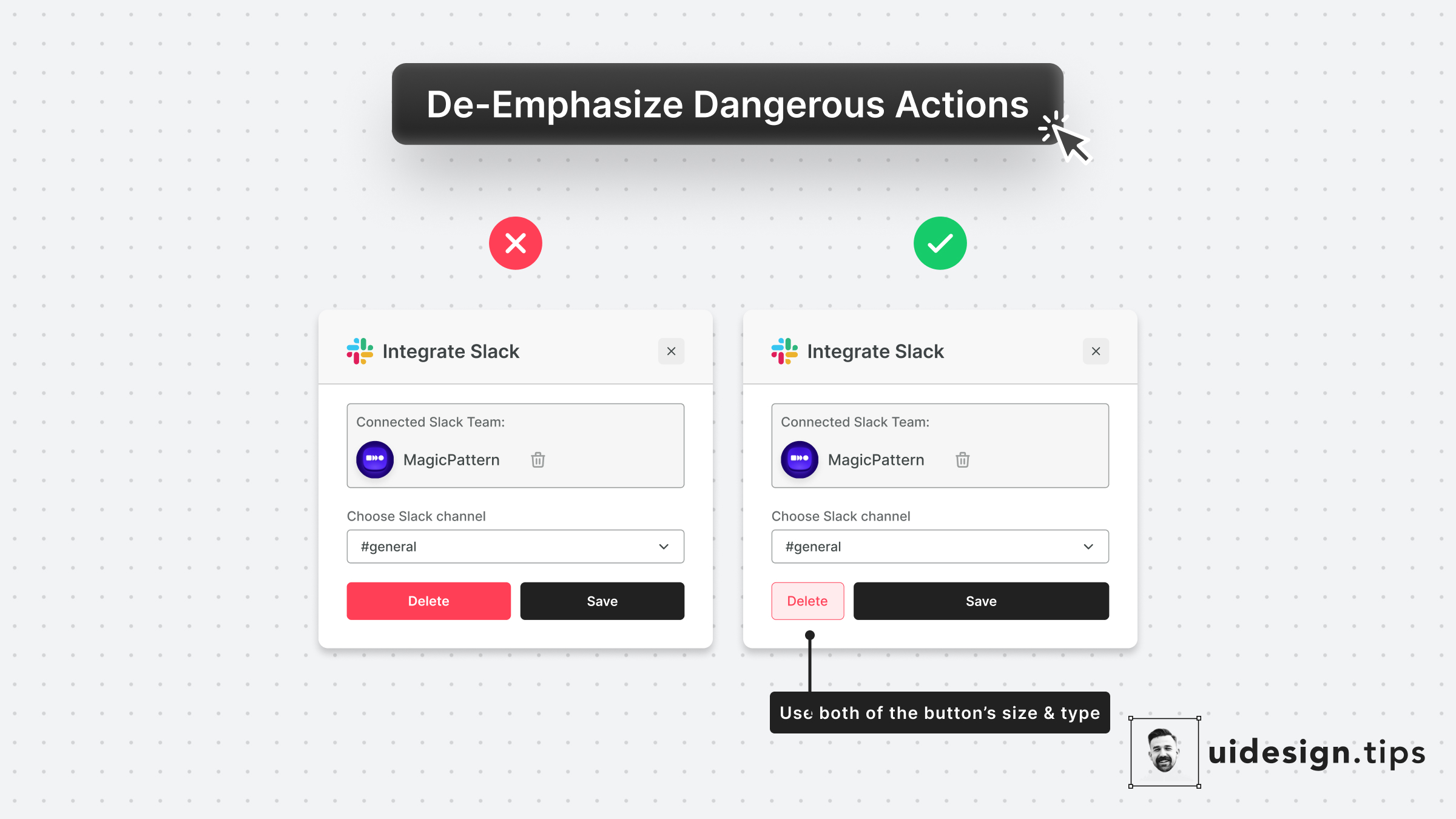
De-emphasize Dangerous Actions
ui
ux
visual effect
dangerous actions
Always try to de-emphasize dangerous actions like deletion.
You have to prioritize the default action instead of the dangerous/irreversible one.
Also, use more than one trait to make the element look like a secondary action (color, size, type, placement, etc).

Become a Better Designer.
The Fun way.
Join 100s of developers, entrepreneurs & junior designers who strive to become better in UI & UX design with byte-sized, practical tips & examples!
Get notified about new tips & articles before anyone else!
"
I love these little tips. It’s like Dribbble but actually useful.
Martin LeBlanc
CEO of Iconfinder
"
I love UX & UI tips. Especially, when they are practical and presented in a very good way. Yours are meeting both criteria.
Lisa Dziuba
Head of Marketing at Abstract


