All Tips


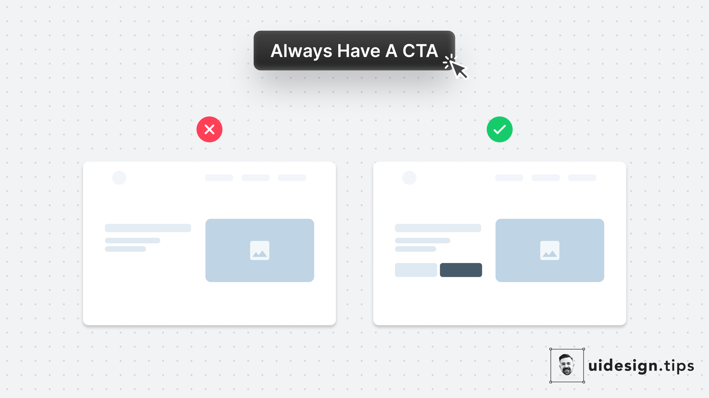
Always Have A CTA
ux
conversions
Always have a CTA button on your website's above the fold section
Many of your visitors might never scroll down your landing page
So you need to offer them an option to convert immediately.

Become a Better Designer.
The Fun way.
Join 100s of developers, entrepreneurs & junior designers who strive to become better in UI & UX design with byte-sized, practical tips & examples!
Get notified about new tips & articles before anyone else!
"
I love these little tips. It’s like Dribbble but actually useful.
Martin LeBlanc
CEO of Iconfinder
"
I love UX & UI tips. Especially, when they are practical and presented in a very good way. Yours are meeting both criteria.
Lisa Dziuba
Head of Marketing at Abstract


