All Tips


The Gutenberg Principle
cta
ux
ux-laws
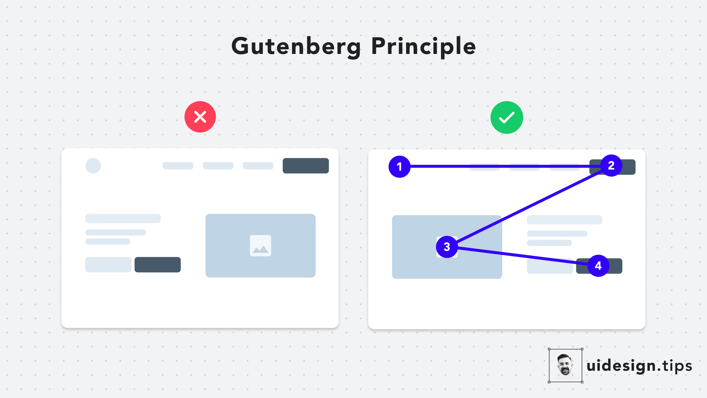
What is The Gutenberg Principle or Z-pattern layout in UI design?
The Gutenberg Principle (aka Z-Pattern Layout) states that users' eyes travel according to a Z-shaped path from the top-left area to the bottom-right area.
How the Gutenberg Principle can help us
It's a good practice to place your CTA at the end of this flow to lead users to take action.

Become a Better Designer.
The Fun way.
Join 100s of developers, entrepreneurs & junior designers who strive to become better in UI & UX design with byte-sized, practical tips & examples!
Get notified about new tips & articles before anyone else!
"
I love these little tips. It’s like Dribbble but actually useful.
Martin LeBlanc
CEO of Iconfinder
"
I love UX & UI tips. Especially, when they are practical and presented in a very good way. Yours are meeting both criteria.
Lisa Dziuba
Head of Marketing at Abstract


