All Tips

Design Better Menus
ui
visual effect
menu
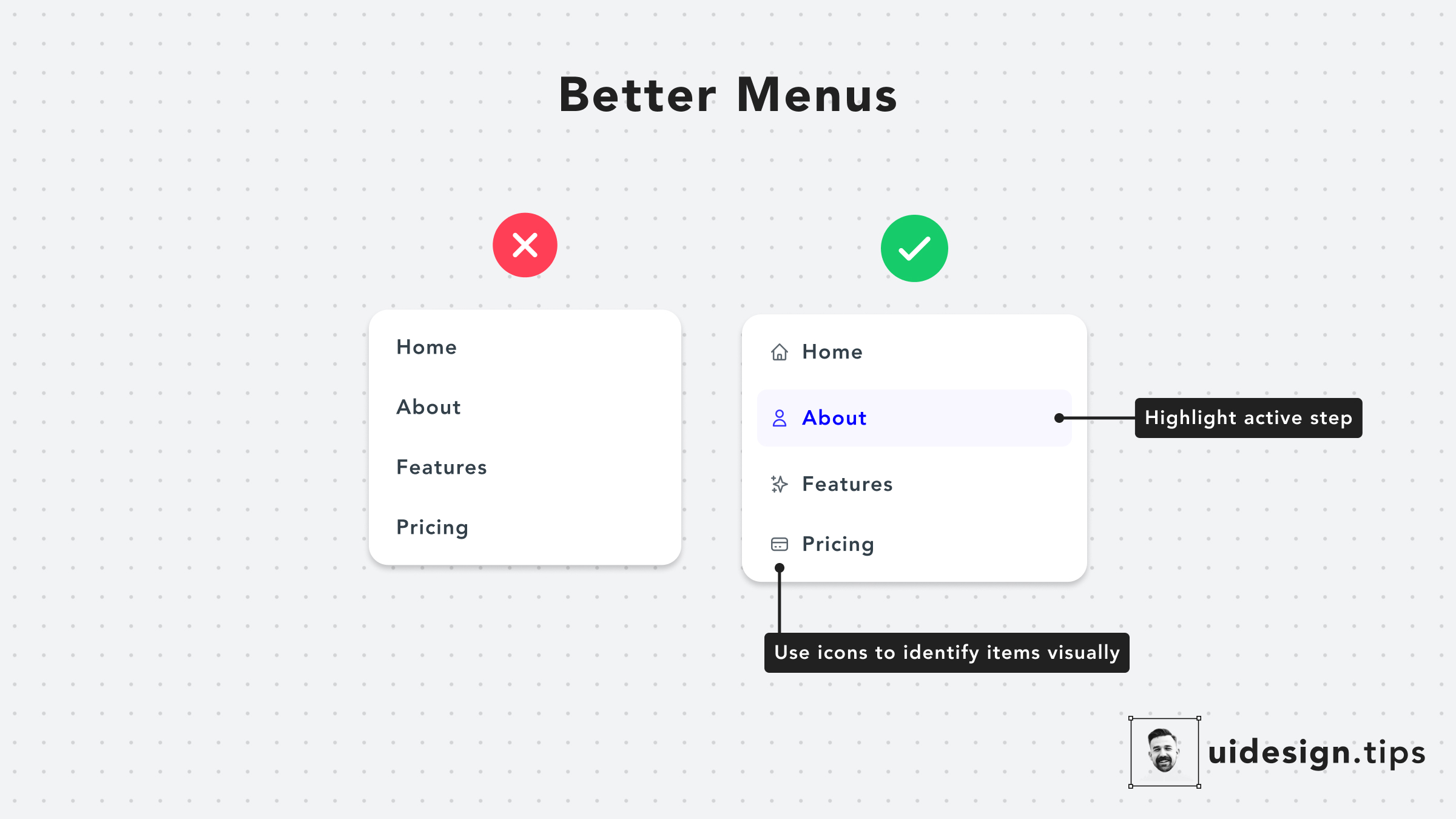
Menus have readability issues very often
A quick hack to make them look and function better is to add an icon next to every action. In that way, you help users visually identify actions without having to read the whole copy.
Also, it's a good practice to highlight the active tab, if it's applicable to the menu's use case.

Become a Better Designer.
The Fun way.
Join 100s of developers, entrepreneurs & junior designers who strive to become better in UI & UX design with byte-sized, practical tips & examples!
Get notified about new tips & articles before anyone else!
"
I love these little tips. It’s like Dribbble but actually useful.
Martin LeBlanc
CEO of Iconfinder
"
I love UX & UI tips. Especially, when they are practical and presented in a very good way. Yours are meeting both criteria.
Lisa Dziuba
Head of Marketing at Abstract
