All Tips


Social Login
ux
login
auth
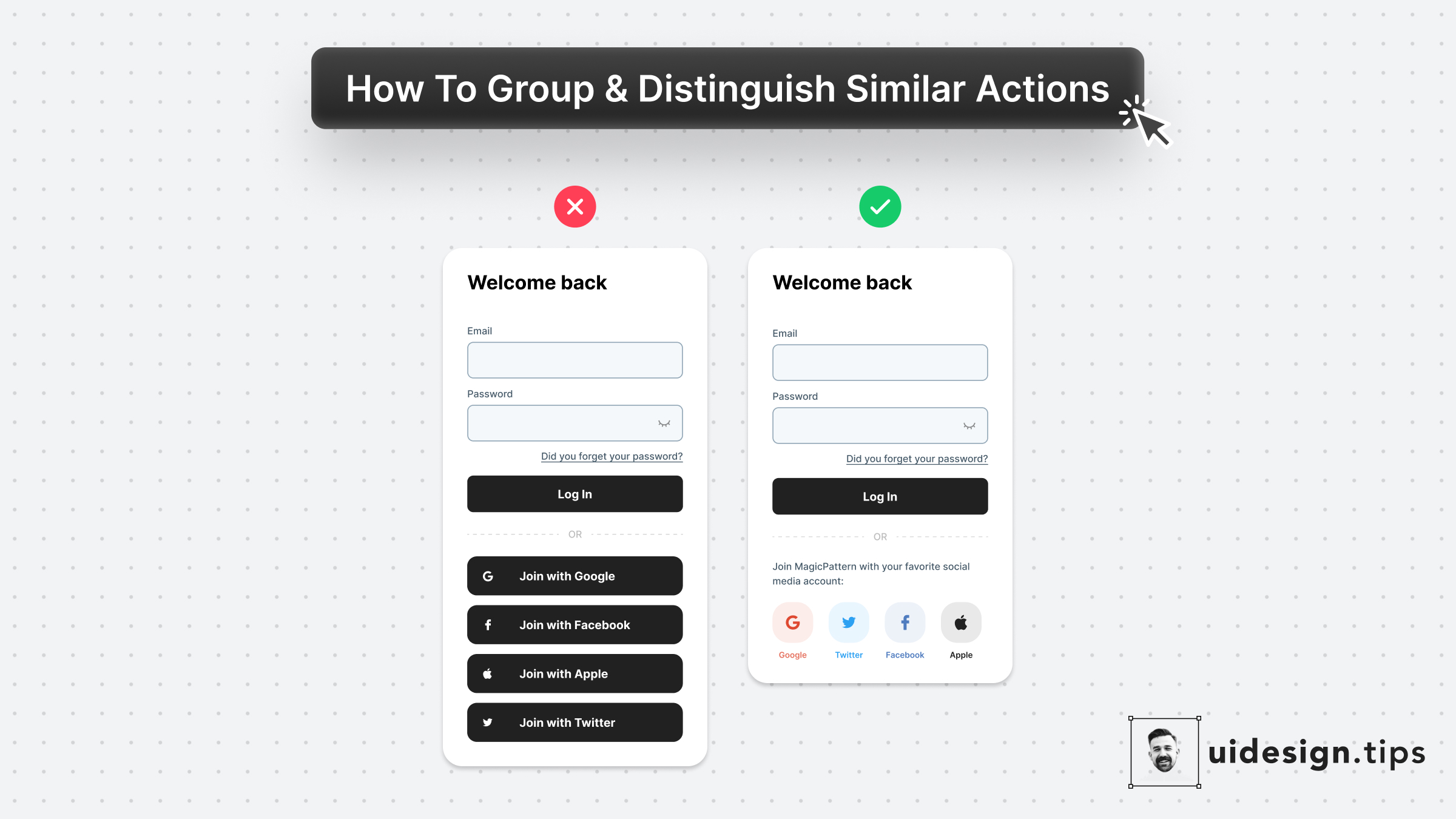
Social login boosts conversion since users can easily join your platform.
Then, it's a good practice to put your social login on top of the page and place the email password authentication below.
Beware that privacy-oriented people prefer not to use social login then it's always good to have another option for them.

Become a Better Designer.
The Fun way.
Join 100s of developers, entrepreneurs & junior designers who strive to become better in UI & UX design with byte-sized, practical tips & examples!
Get notified about new tips & articles before anyone else!
"
I love these little tips. It’s like Dribbble but actually useful.
Martin LeBlanc
CEO of Iconfinder
"
I love UX & UI tips. Especially, when they are practical and presented in a very good way. Yours are meeting both criteria.
Lisa Dziuba
Head of Marketing at Abstract


