
RECOMMENDED
All Tips
Visually Separate Elements
visual effect
hierarchy
ui
ux
whitespace
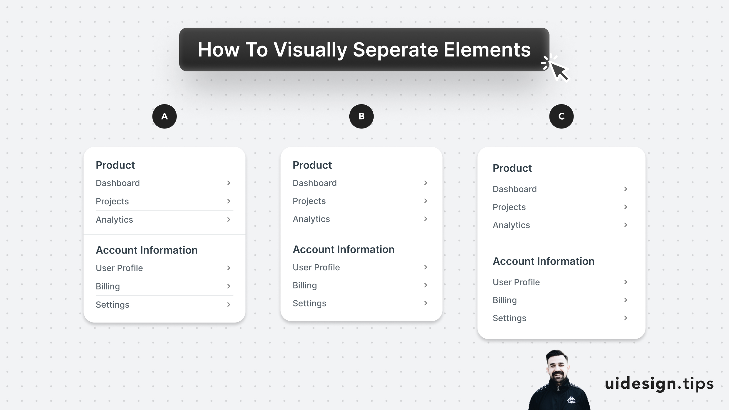
Prefer to visually separate menu sections with whitespace. Whitespace makes the UI look cleaner and request less cognitive effort from the user.
In the example below:
- A uses dividers for everything
- B uses a divider between sections
- C uses only whitespace
A is too complex and distracts the user, but both B & C can be used on real-life user interfaces.
B puts more attention on differentiating the sections. C makes the UI look cleaner.
Become a Better Designer.
The Fun way.
Join 100s of developers, entrepreneurs & junior designers who strive to become better in UI & UX design with byte-sized, practical tips & examples!
Get notified about new tips & articles before anyone else!
"
I love these little tips. It’s like Dribbble but actually useful.
Martin LeBlanc
CEO of Iconfinder
"
I love UX & UI tips. Especially, when they are practical and presented in a very good way. Yours are meeting both criteria.
Lisa Dziuba
Head of Marketing at Abstract