All Tips


Padding On Rounded Cards
visual effect
ui
card
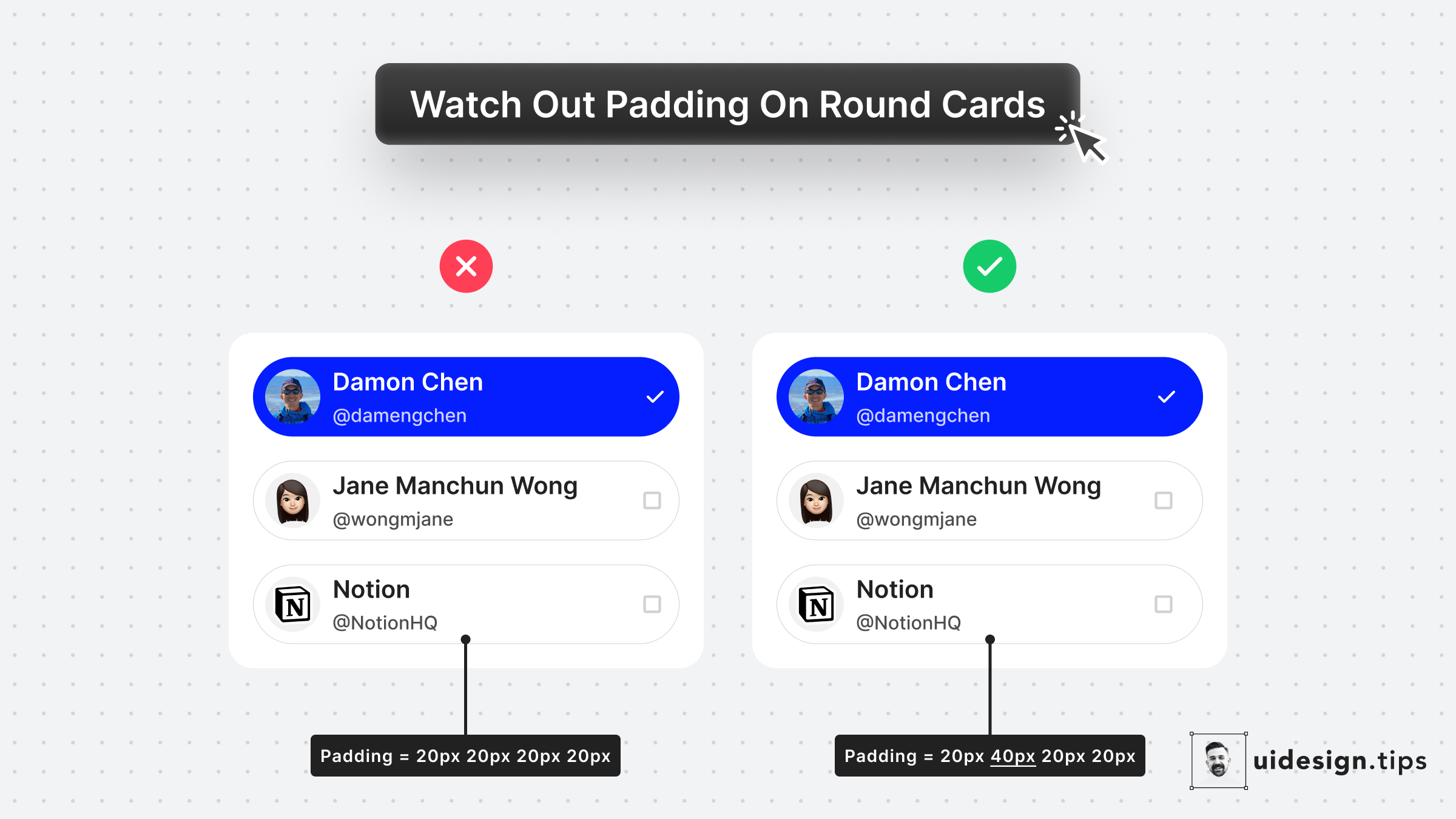
The left cards use the same padding around the card. Yet the visual result seems off.
A quick fix is to make the padding larger when the element on the edge is not round - like icons and text.
The rule of thumb is to use double the padding on the edge which is not round.

Become a Better Designer.
The Fun way.
Join 100s of developers, entrepreneurs & junior designers who strive to become better in UI & UX design with byte-sized, practical tips & examples!
Get notified about new tips & articles before anyone else!
"
I love these little tips. It’s like Dribbble but actually useful.
Martin LeBlanc
CEO of Iconfinder
"
I love UX & UI tips. Especially, when they are practical and presented in a very good way. Yours are meeting both criteria.
Lisa Dziuba
Head of Marketing at Abstract


