All Tips

Use Labels Cleverly 1
labels
ux
forms
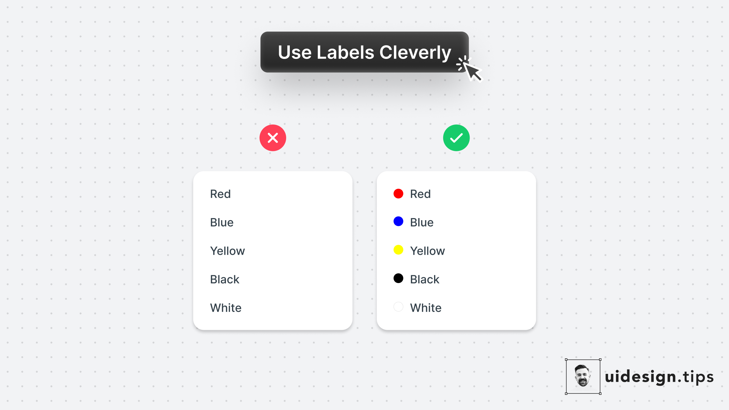
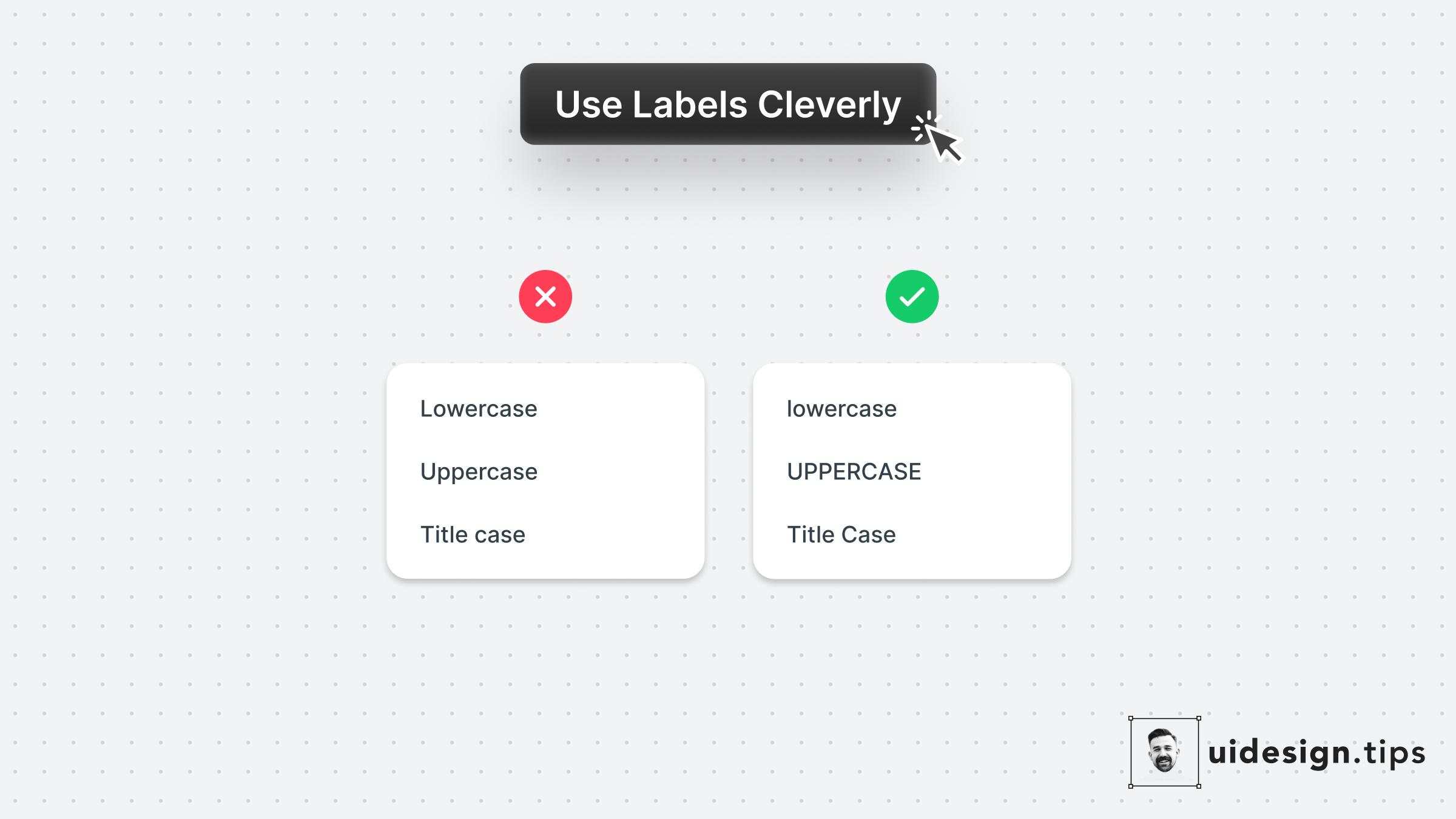
Complement your link copy with a visual representation of the selected value. In this example, the labels show you how capitalization will look.
It's not always possible to do this hack, so go all into it when the opportunity presents itself.

Become a Better Designer.
The Fun way.
Join 100s of developers, entrepreneurs & junior designers who strive to become better in UI & UX design with byte-sized, practical tips & examples!
Get notified about new tips & articles before anyone else!
"
I love these little tips. It’s like Dribbble but actually useful.
Martin LeBlanc
CEO of Iconfinder
"
I love UX & UI tips. Especially, when they are practical and presented in a very good way. Yours are meeting both criteria.
Lisa Dziuba
Head of Marketing at Abstract
