All Tips


Use Labels Cleverly 2
accessibility
labels
forms
ux
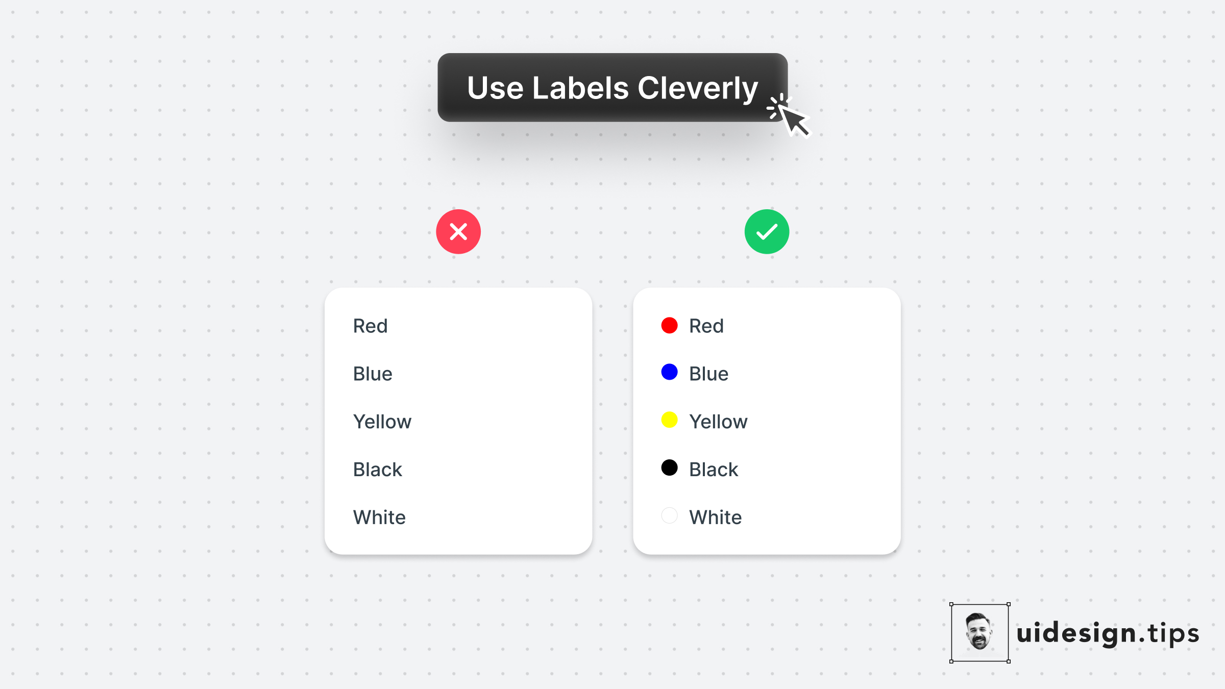
A smart use case for labels is on color pickers with predefined values.
Depending on the app's context you can even omit labels.
Consider keeping them for color-blind people who struggle to identify colors though.

Become a Better Designer.
The Fun way.
Join 100s of developers, entrepreneurs & junior designers who strive to become better in UI & UX design with byte-sized, practical tips & examples!
Get notified about new tips & articles before anyone else!
"
I love these little tips. It’s like Dribbble but actually useful.
Martin LeBlanc
CEO of Iconfinder
"
I love UX & UI tips. Especially, when they are practical and presented in a very good way. Yours are meeting both criteria.
Lisa Dziuba
Head of Marketing at Abstract

