All Tips
Support Icons With Labels
icon
accessibility
ux
ui
mobile
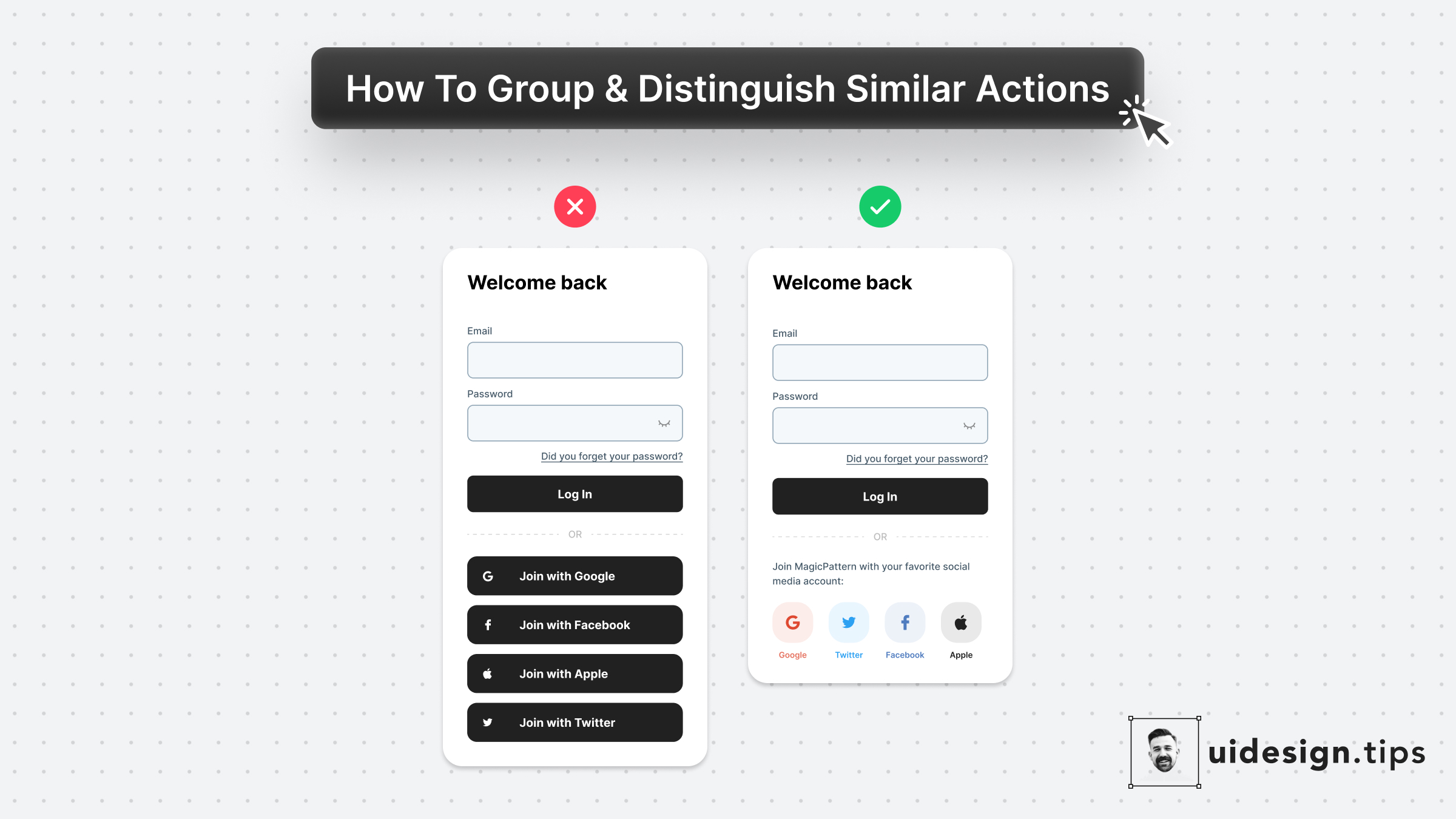
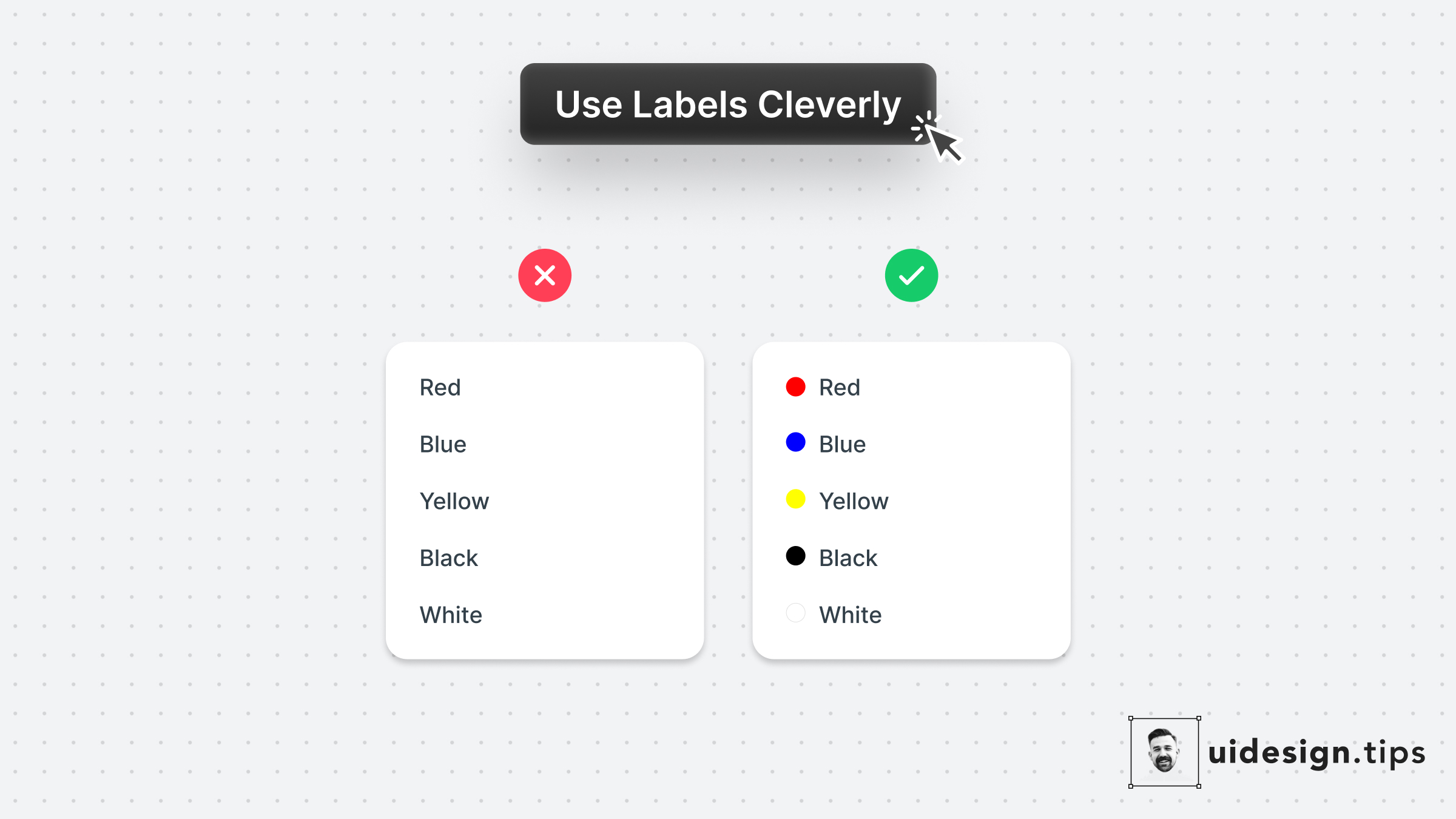
Icons can often confuse users or get misinterpreted by different people due to their experience level or even due to their culture.
Fix this accessibility issue is by adding a subtle text label near the icon which will describe its usage.
Keep this information in mind especially for mobile interfaces which don't support hover effects.

Become a Better Designer.
The Fun way.
Join 100s of developers, entrepreneurs & junior designers who strive to become better in UI & UX design with byte-sized, practical tips & examples!
Get notified about new tips & articles before anyone else!
"
I love these little tips. It’s like Dribbble but actually useful.
Martin LeBlanc
CEO of Iconfinder
"
I love UX & UI tips. Especially, when they are practical and presented in a very good way. Yours are meeting both criteria.
Lisa Dziuba
Head of Marketing at Abstract


