UI Tips
UX Tips
Articles
Newsletter
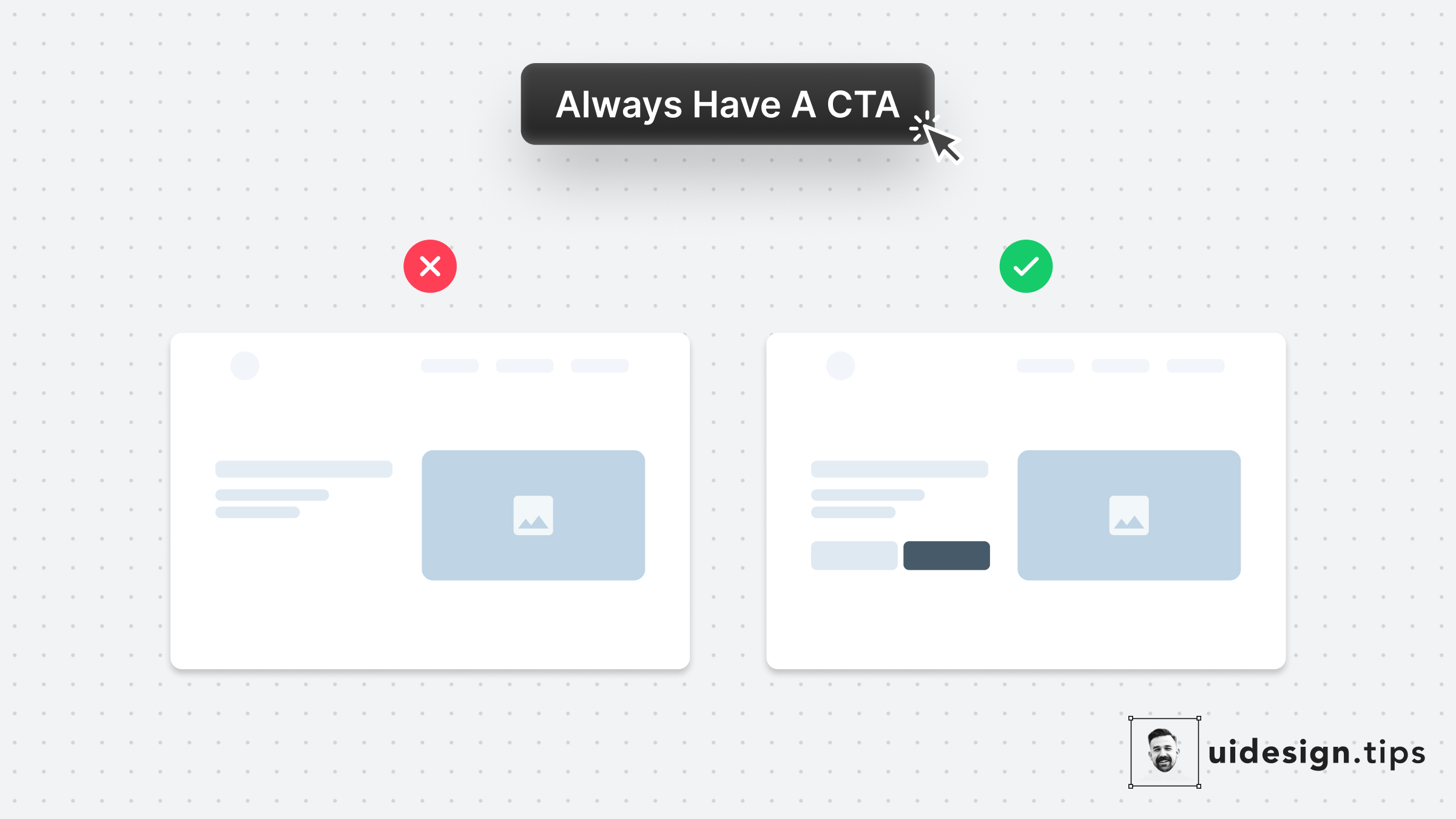
Always have a CTA button on your website's above the fold section Many of your visitors might never scroll down your landing page So you need to offer them an option to convert immediately.
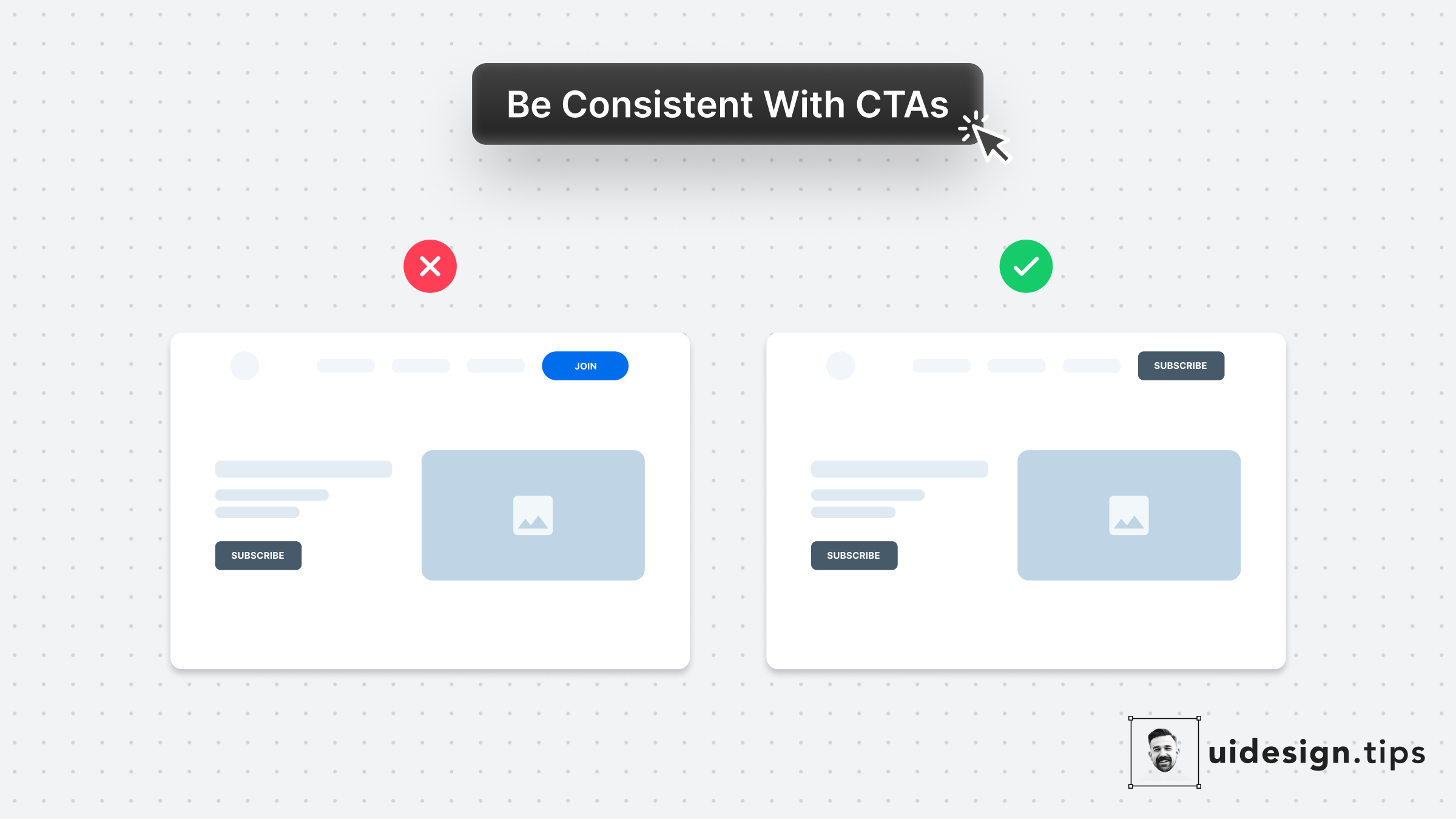
Your design, and mostly your buttons, need to be consistent thought the user interface. Keep this in mind especially for the header (hero) section. Don't confuse your visitors with different buttons in styles and copy. For almost all cases, you only need **a single primary CTA** for your top screen.
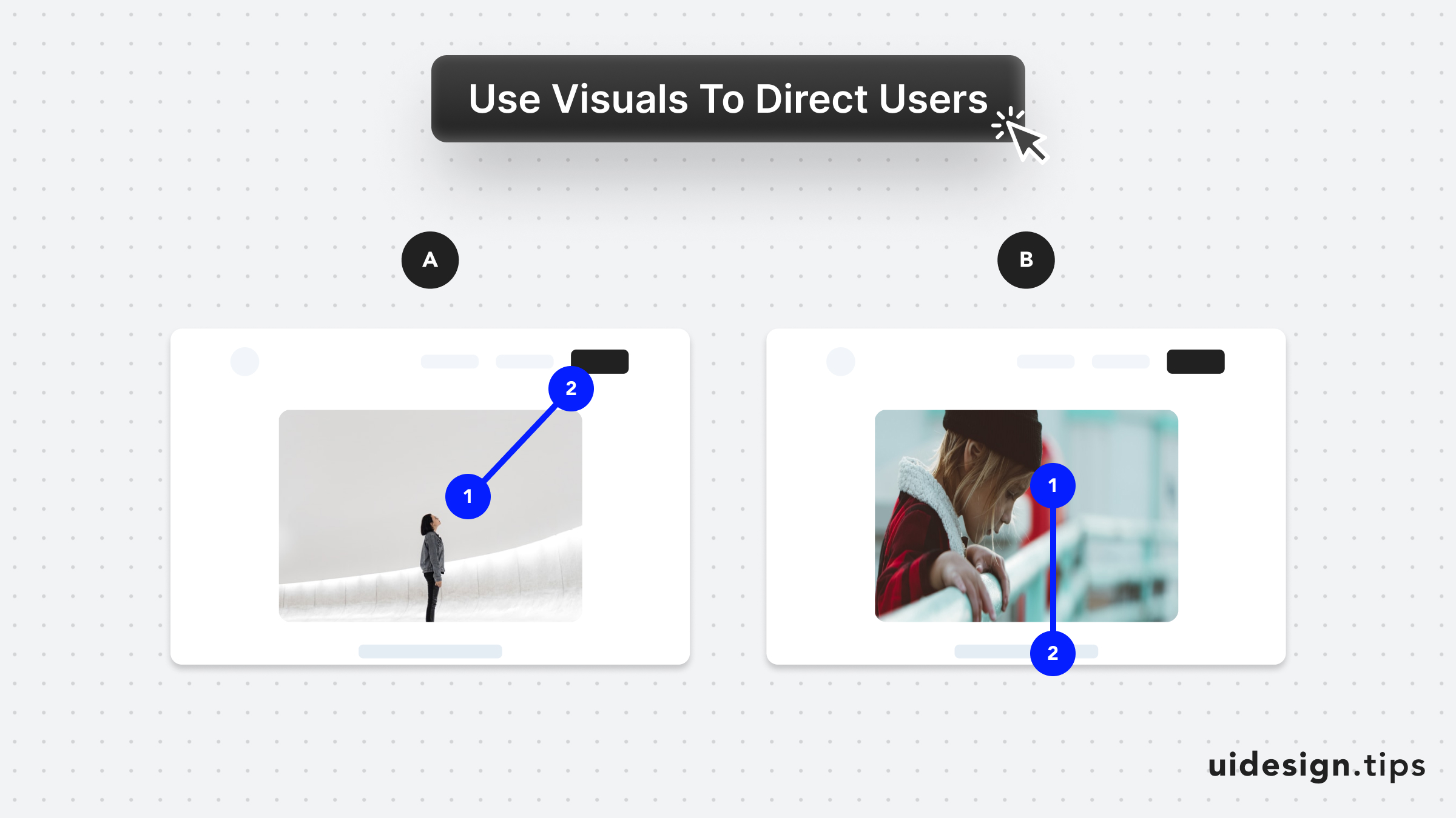
Leverage visuals to direct user's attention As humans, we tend to follow another person's line of sight. Take advantage of this effect, by prompting people to focus on individual elements (A) or scroll (B).
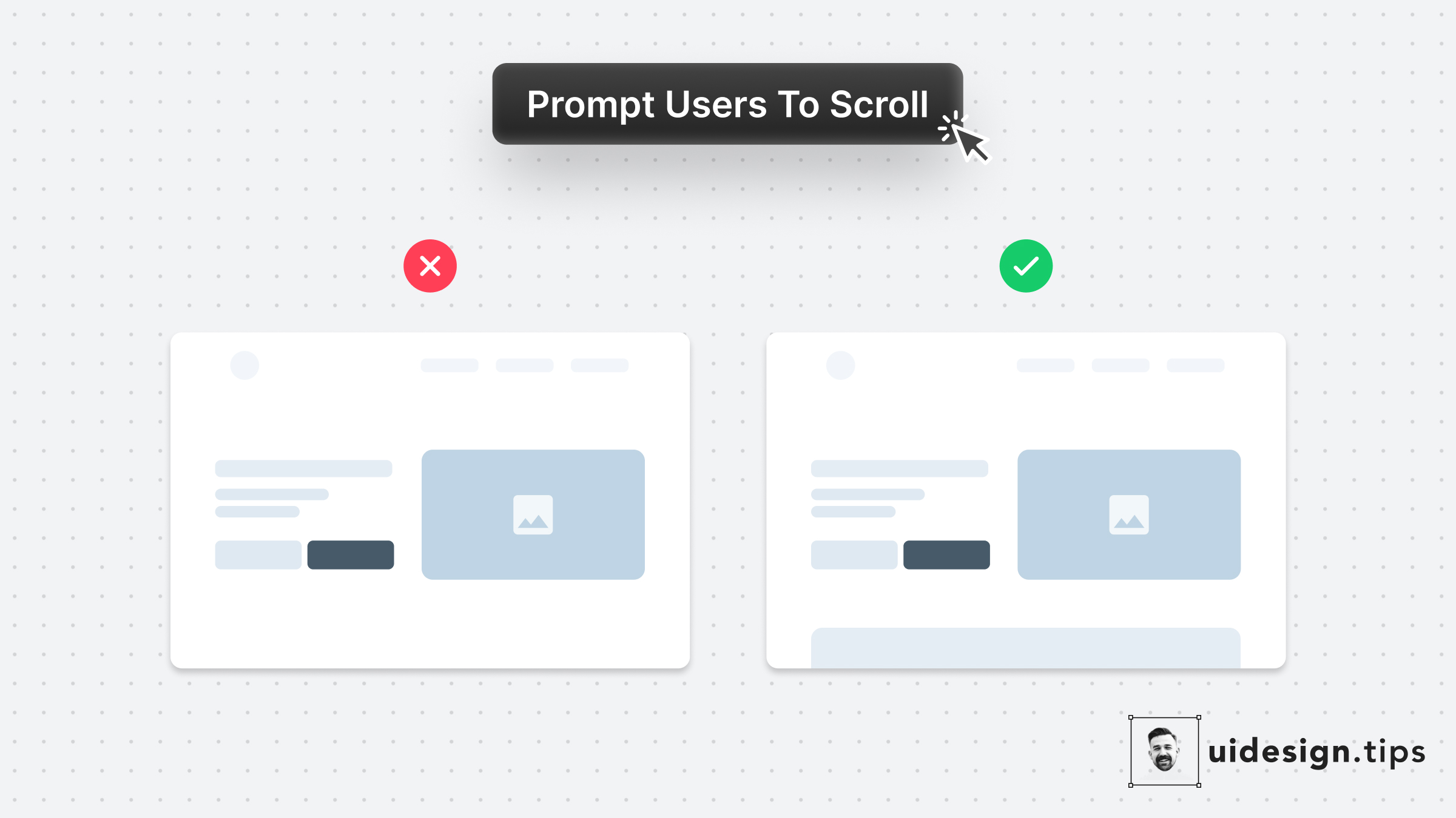
Your website needs to prompt users to scroll to communicate your product's value better. Especially when the header content is not enough to describe your product's value. A simple hack to prompt users to scroll is by showing them a glimpse of the next section. In that way, the user knows there is more information on the site and becomes curious to explore it further.
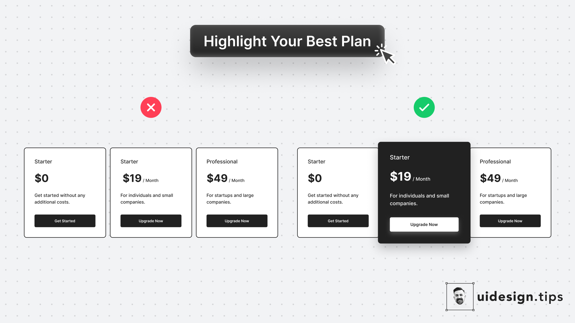
Always highlight your best pricing plan and make it pop out. In that way, you help users identify the most used plan and you promote your top offer. It's a win-win situation. To highlight the plan, use more than one design ways, eg. color, size, elevation (aka shadow)!
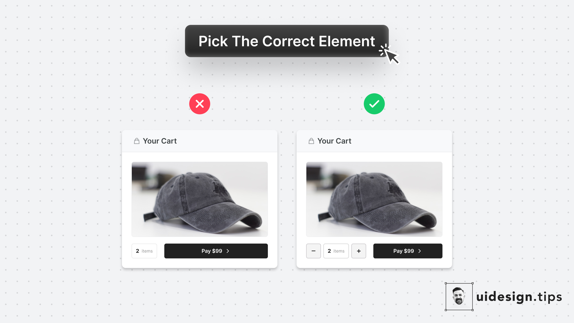
Make it as simple as possible for users to enter their information.⠀ ⠀ Choosing the right UI element plays a huge part in upgrading UX.⠀ ⠀ For example, use a number picker for integer numeric values instead of a generic text field. In eCommerce carts, most users will buy 1, or 2 items maximum. The -/+ buttons make their input process quicker.
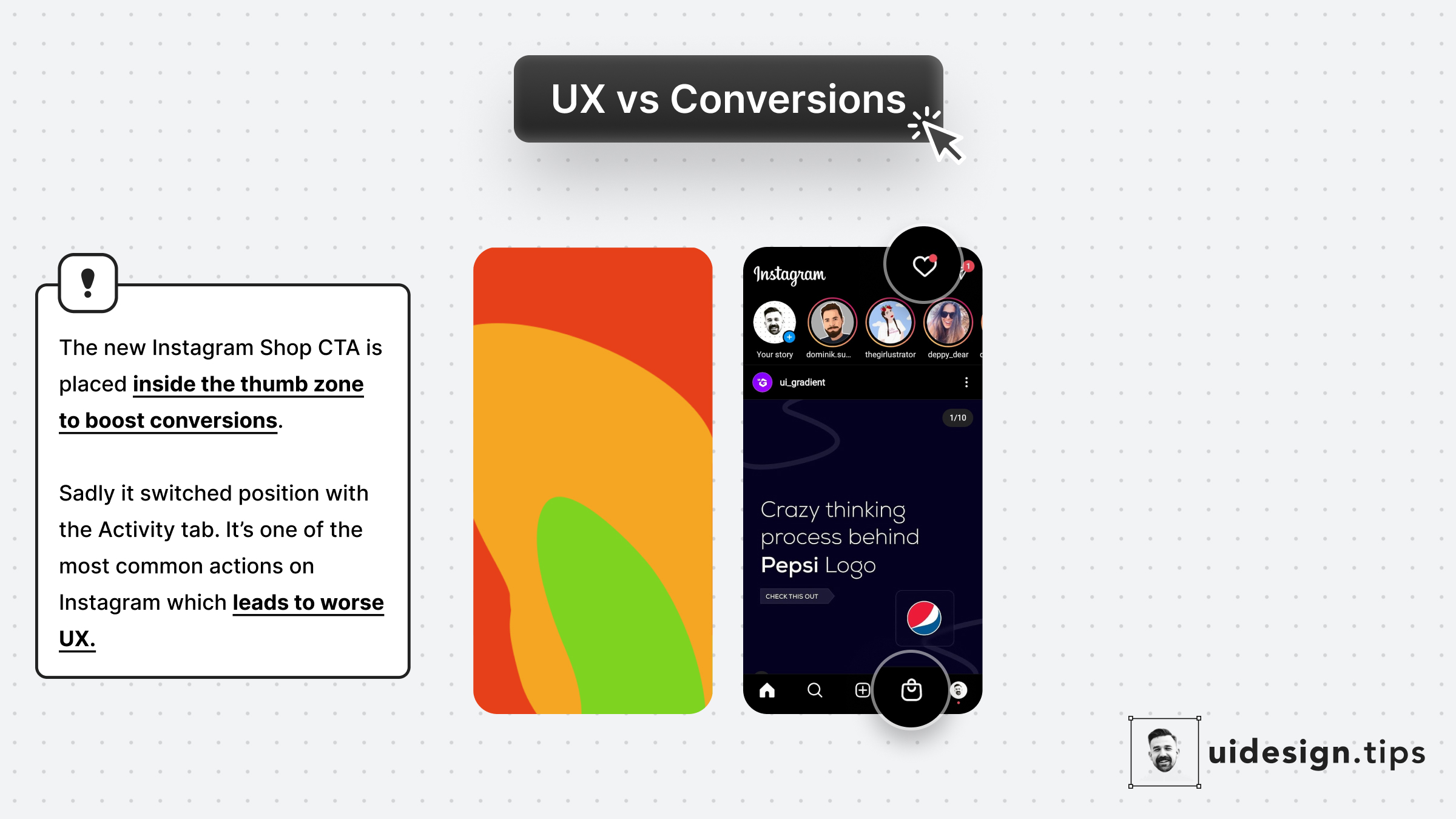
Instagram recently launched Shop. The decision to place it at the position of the Activity tab is not random... 1. More reachable since it's in the Thumb Zone 2. More accidental clicks bc users will reach for the activity tab This might lead to better conversions but make the user experience x10 worse. 10 annoyed users are far worse than an extra customer.