UI Design Tips by Jim Raptis
Learn how to design better user interfaces and make your users happier with these simple UI tips. All the tips are tested in real-life products!!!
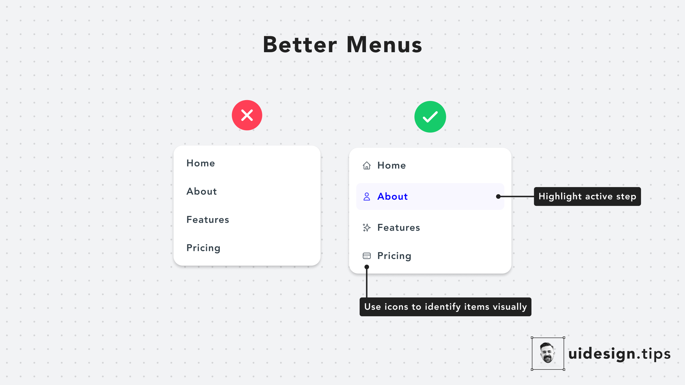
Design Better Menus
Menus have readability issues very often A quick hack to make them look and function better is to add an icon next to every action. In that way, you help users visually identify actions without having to read the whole copy. Also, it's a good practice to highlight the active tab, if it's applicable to the menu's use case.
uivisual effectmenu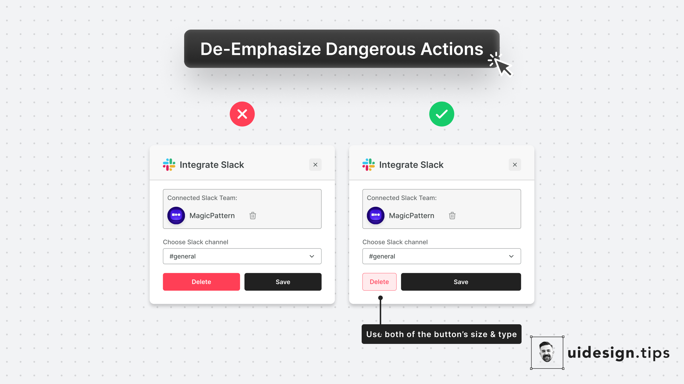
De-emphasize Dangerous Actions
Always try to de-emphasize dangerous actions like deletion. You have to prioritize the default action instead of the dangerous/irreversible one. Also, use more than one trait to make the element look like a secondary action (color, size, type, placement, etc).
uiuxvisual effectdangerous actions
The Perfect Header
A good header needs to put attention on the title and then lead the reader to the description, which must be readable. A few quick hacks to achieve this hierarchy include: 1. Stronger font-weight for the title 2. A consistent type scale system. The most common is x1.25, which means that if the title is 40px, the subtitle must be 40/1.25 = 32px. 3. Lower contrast for the subtitle 4. Proper line-height for the description text. 5. Left alignment, since it boosts readability
hierarchyuiuxvisual effectheader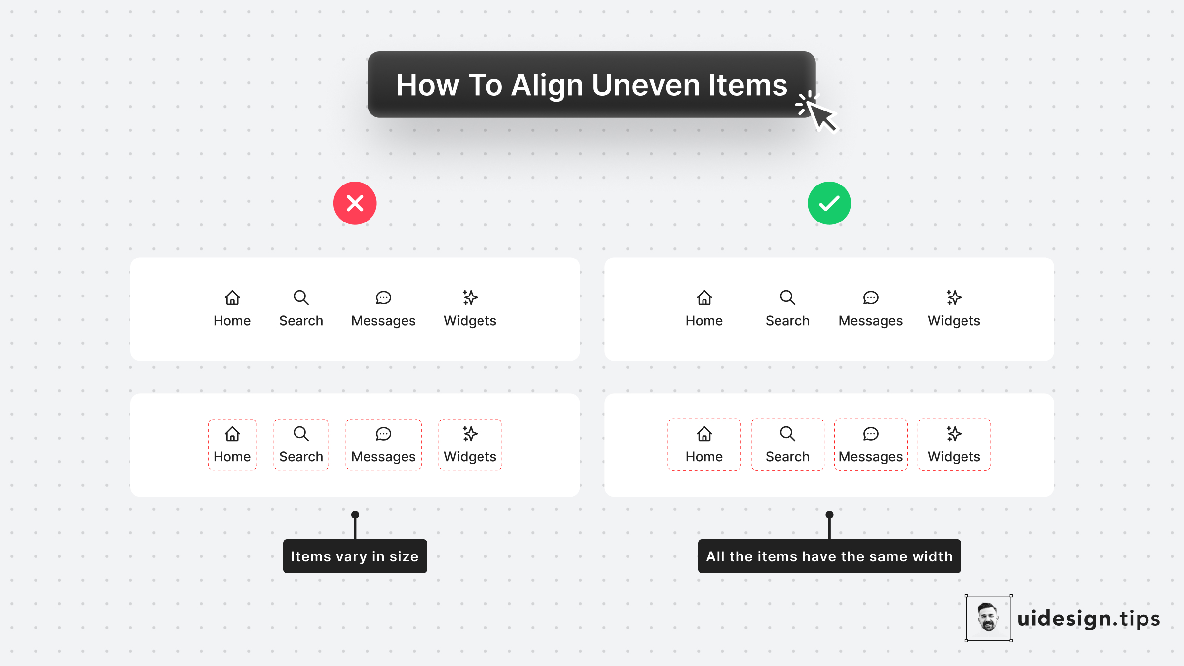
How to Align Uneven Items
Aligning uneven items can become weird Even if the spacing between them is the same, the visual result seems off sometimes. A super-quick fix is to set the same width for all the elements. Pick the width of the biggest element and apply it to all the other items.
alignmentuivisual effect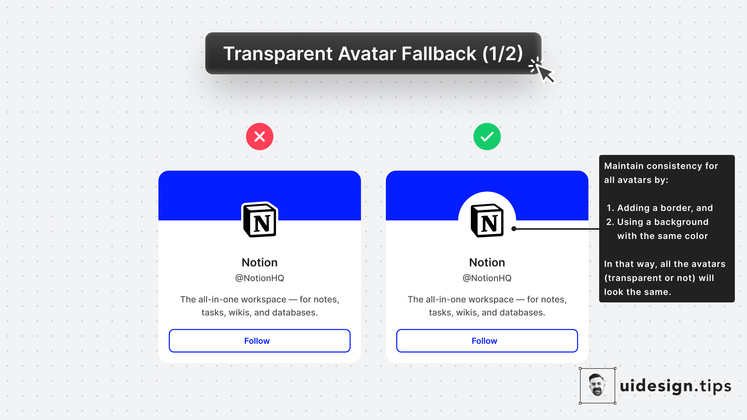
Fallback for Transparent Avatars 1
Many platforms (like Twitter) allow PNG avatars that can cause UI inconsistencies To avoid this problem add a subtle border and background color to the avatar that is the same as the app's background.
avatarvisual effectui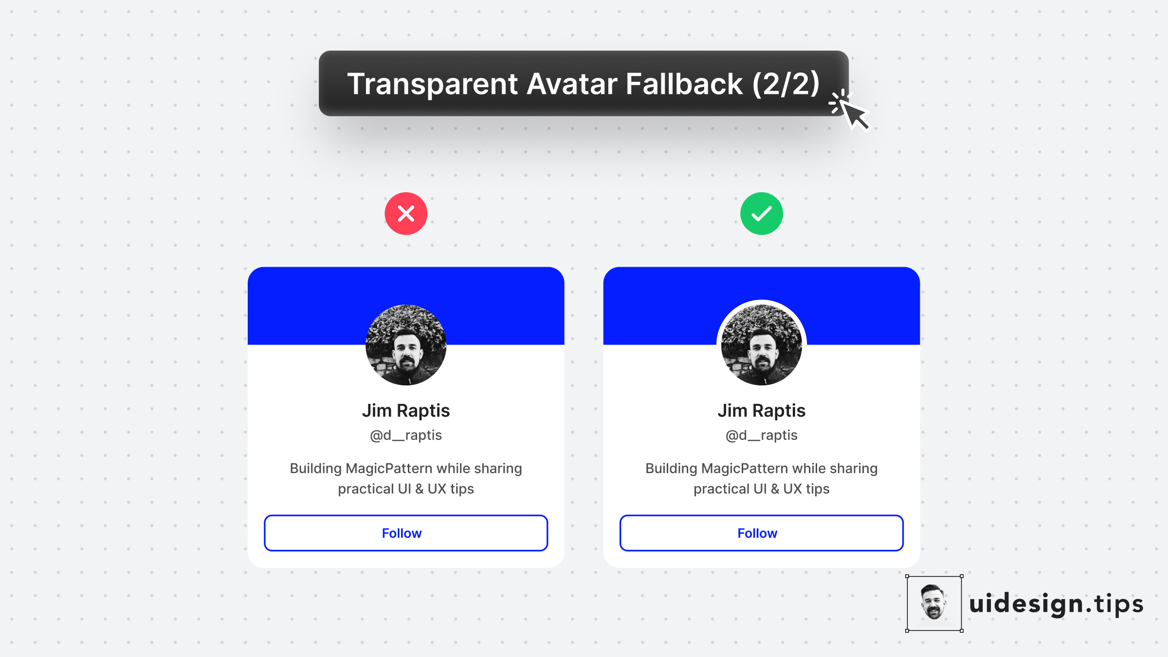
Fallback for Transparent Avatars 2
Another visual hack to ensure consistency for transparent avatars is by adding a subtle border around them, the same color as the background. The border looks like it's part of the background and distinguishes it from the cover section.
avatarvisual effectui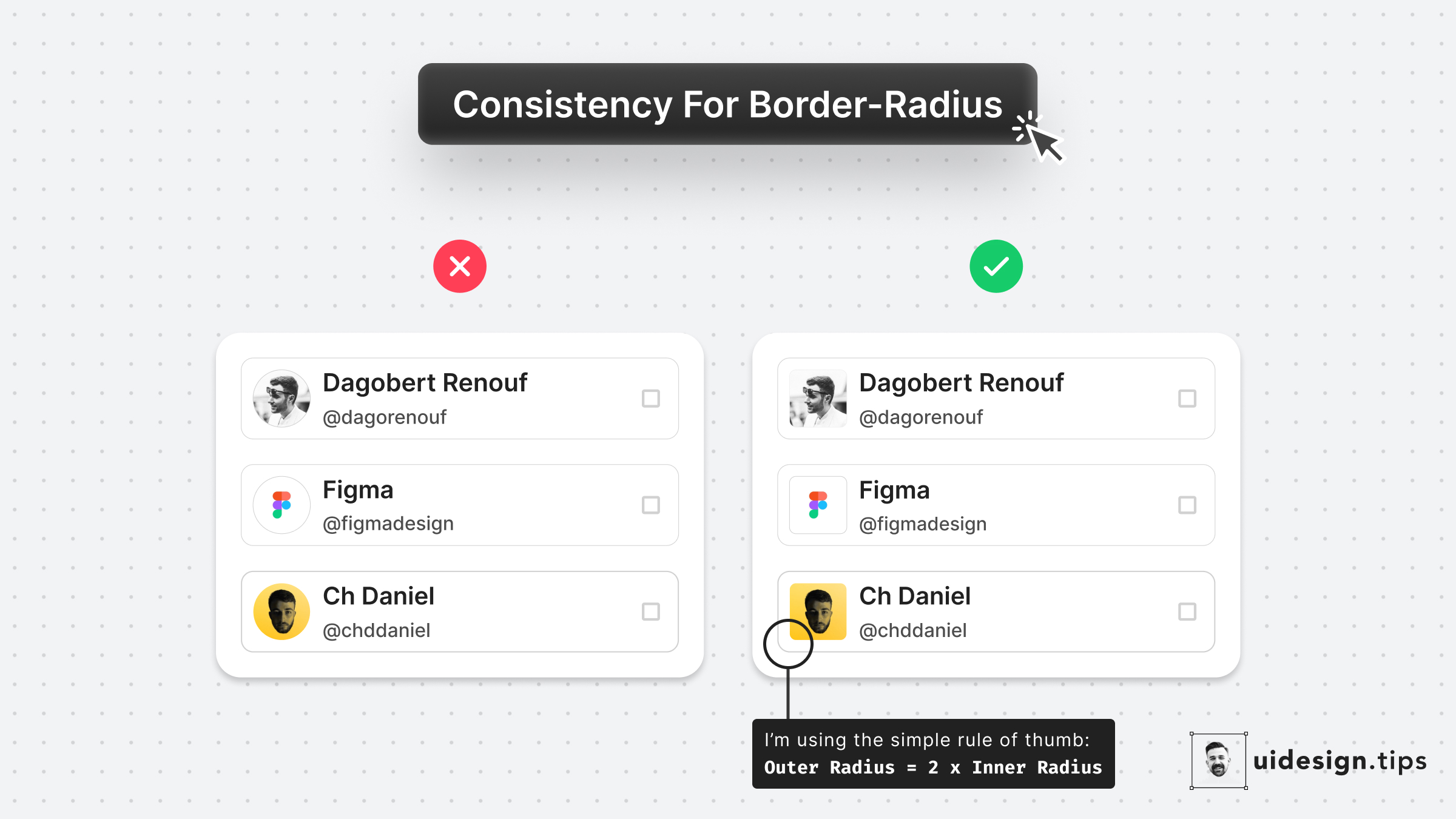
Consistent Border-Radius
Round images usually look weird when they're included in a card with a small border-radius. Use the simple rule of thumb: 𝙊𝙪𝙩𝙚𝙧 𝙍𝙖𝙙𝙞𝙪𝙨 = 2 * 𝙄𝙣𝙣𝙚𝙧 𝙍𝙖𝙙𝙞𝙪𝙨 * The precise formula is more complicated since you need to take into account the spacing between the two borders, so let's it simple!
carduivisual effect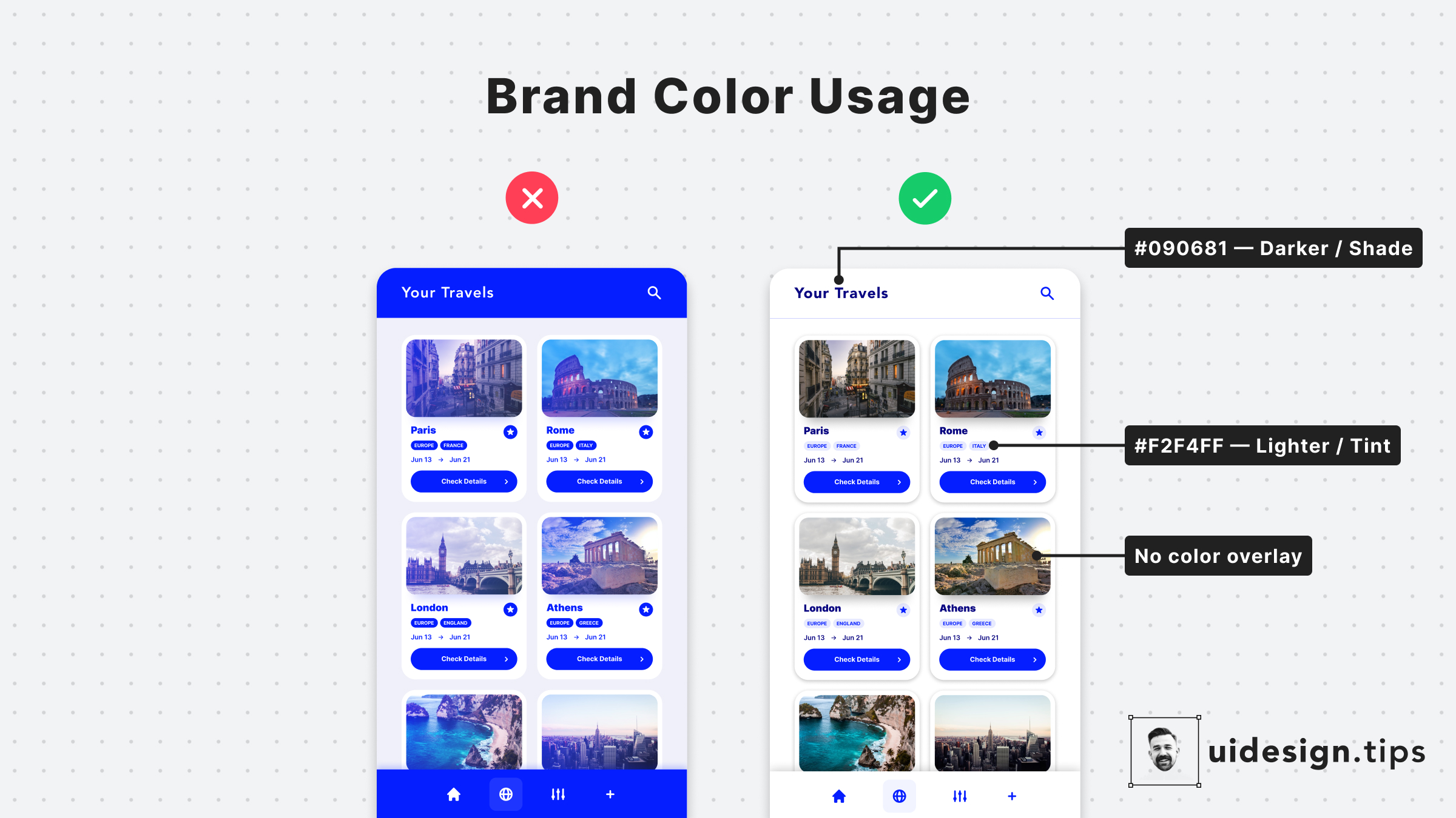
How to Apply the Brand Color
Colors are a core element for any user interface. One of the most common mistakes in UI design is the over usage of the brand color. Avoid it by highlighting only the most important elements of your interface with your primary color. For the rest of the elements, combine tints & shades of your main color.
coloruivisual effecthierarchy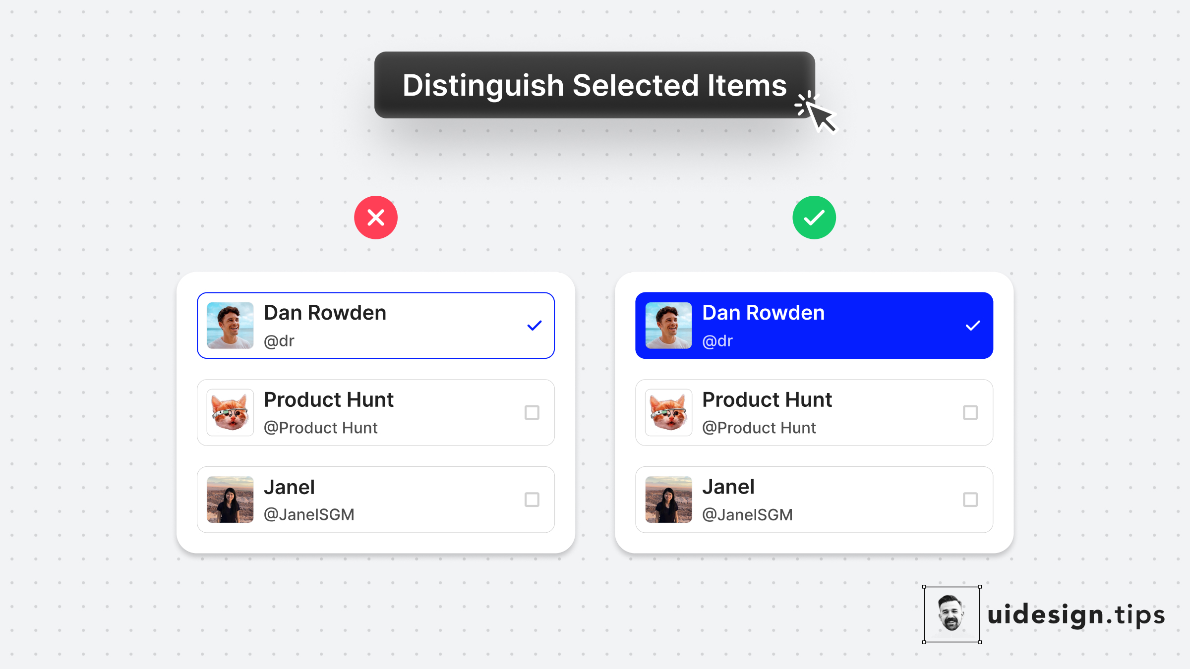
Distinguish Selected Items
Always make sure that your selected items are easily identified at a glance. Changing the background color is a simple and accessible way to achieve it! It makes the user experience better since the user can easily figure out which elements are already selected.
uxuivisual effecthierarchy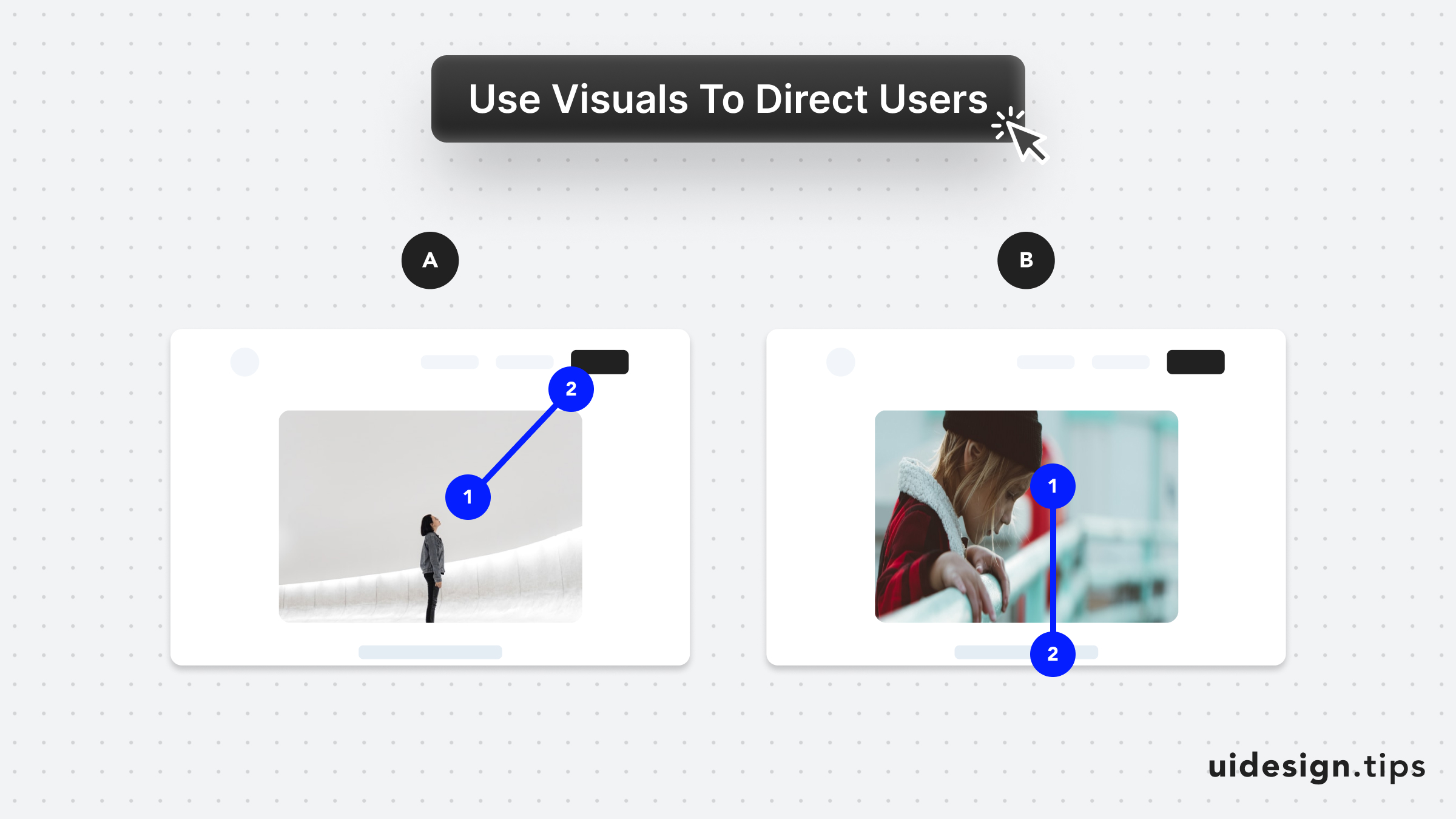
Direct User Attention with Media
Leverage visuals to direct user's attention As humans, we tend to follow another person's line of sight. Take advantage of this effect, by prompting people to focus on individual elements (A) or scroll (B).
attentionuxconversionsvisual effect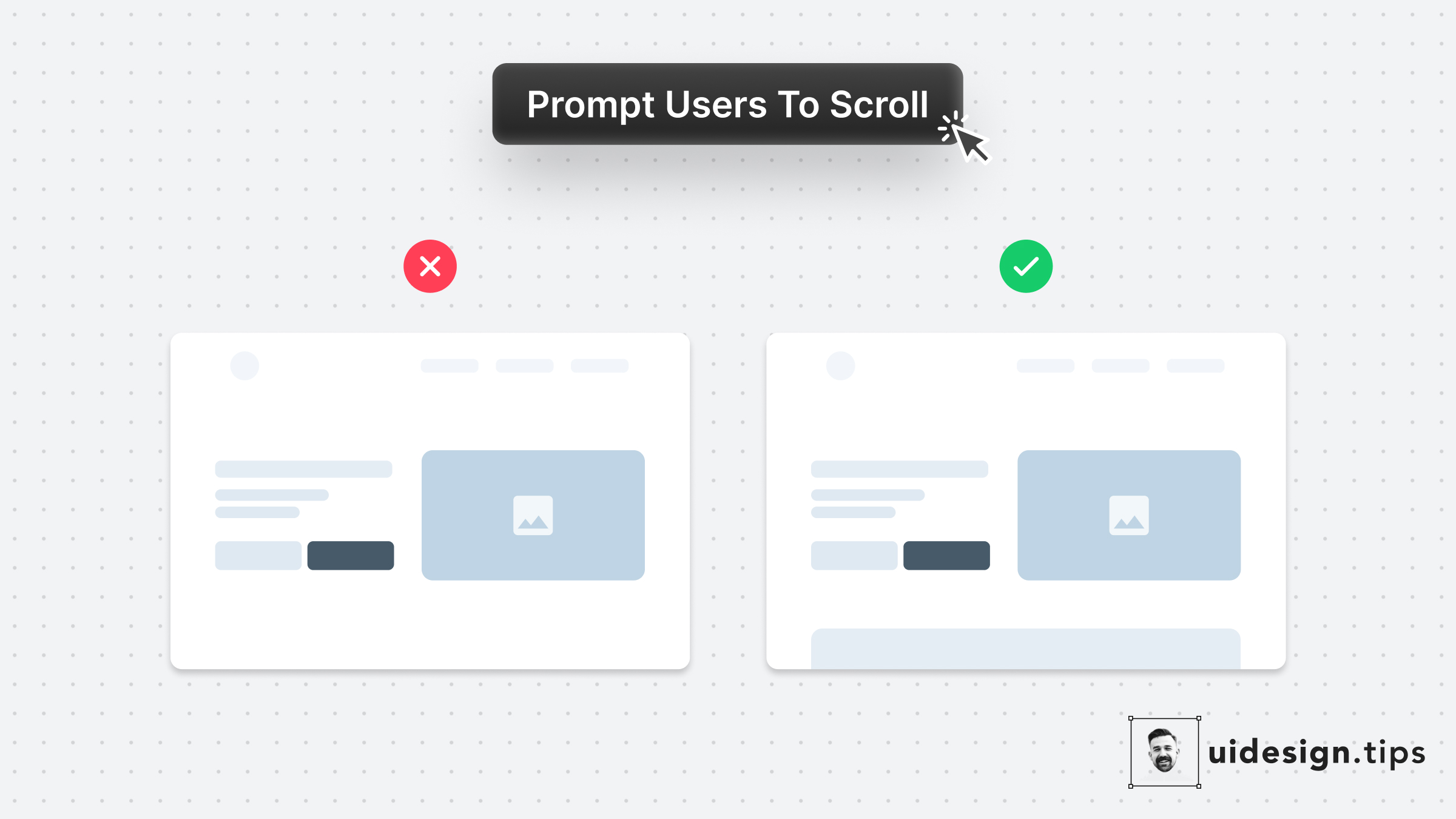
Prompt User to Scroll
Your website needs to prompt users to scroll to communicate your product's value better. Especially when the header content is not enough to describe your product's value. A simple hack to prompt users to scroll is by showing them a glimpse of the next section. In that way, the user knows there is more information on the site and becomes curious to explore it further.
landing pageconversionsuxvisual effect
How To Enhance Hierarchy
Visual hierarchy is important in design because it boosts the user experience and leads the user attention Your No.1 priority is to make your primary action (aka CTA) prominent. In this case, the button that initiates the booking process is the main CTA. Then you need to make text readable & distinguish element types. eg. Tags must not look like the primary button. Play with text attributes (weight, size, line height) to hack visual attention & hierarchy.
visual effecthowctauxui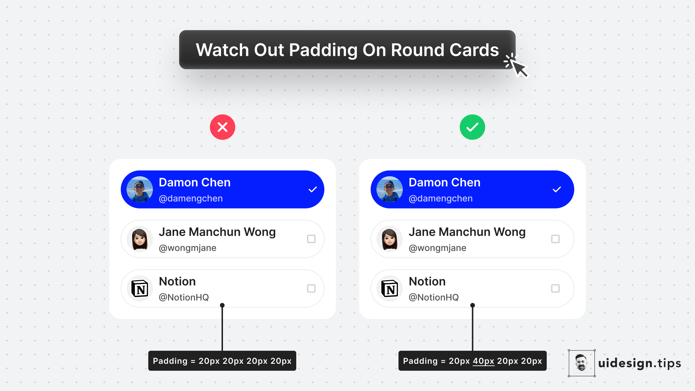
Padding On Rounded Cards
The left cards use the same padding around the card. Yet the visual result seems off. A quick fix is to make the padding larger when the element on the edge is not round - like icons and text. The rule of thumb is to use **double the padding** on the edge which is not round.
visual effectuicard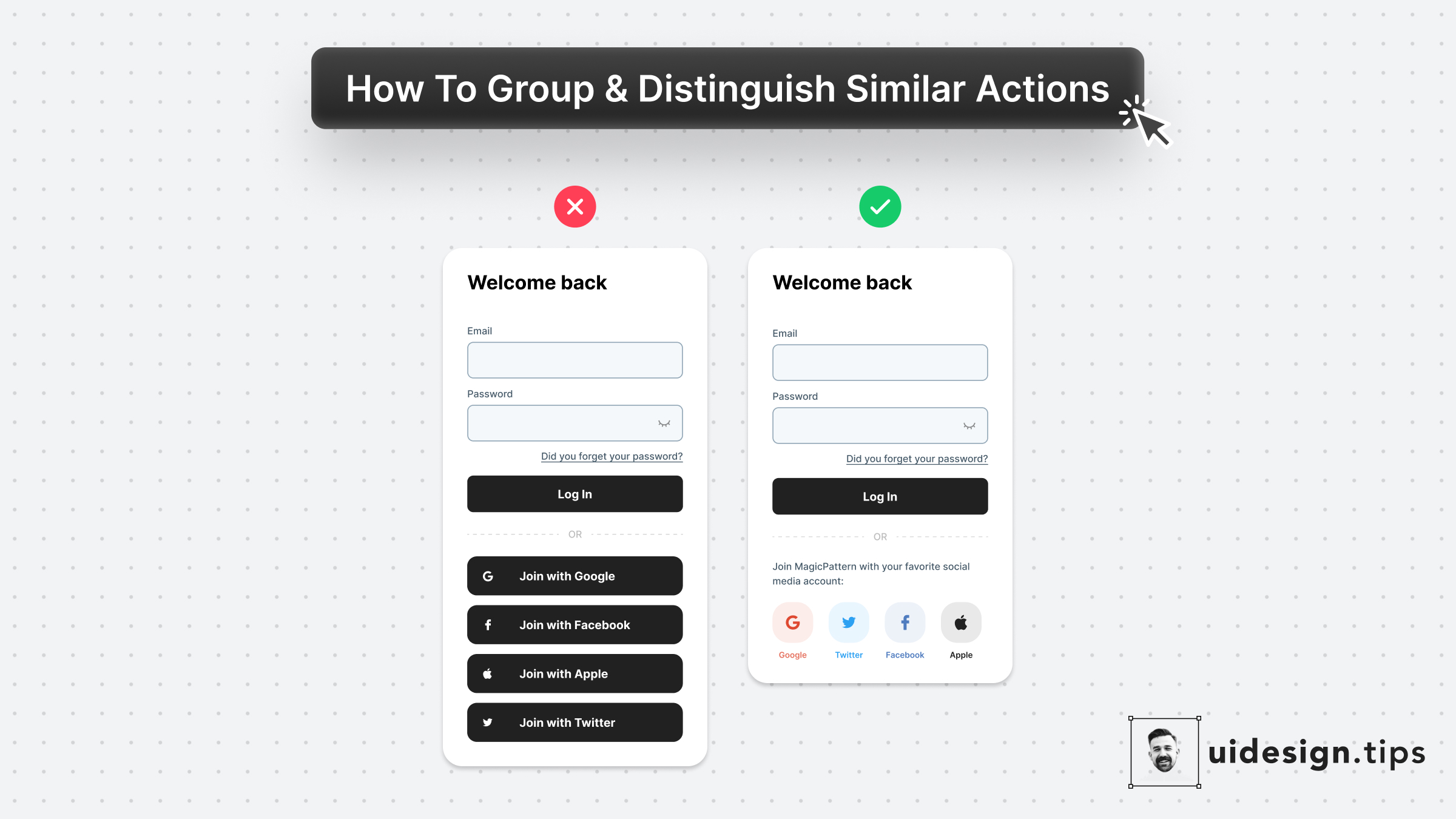
Visually Distinguish Elements
Visually distinguish elements by applying unique shapes, colors, copies, and/or icons. In that way, you ensure that visual hierarchy works perfectly and you avoid accessibility issues. To boost the strength of the visual effect use multiple attributes (color + icon) and not a single one (only color). The latter helps you avoid accessibility issues as well. Color blind people won't notice the color changes.
visual effectuiuxbutton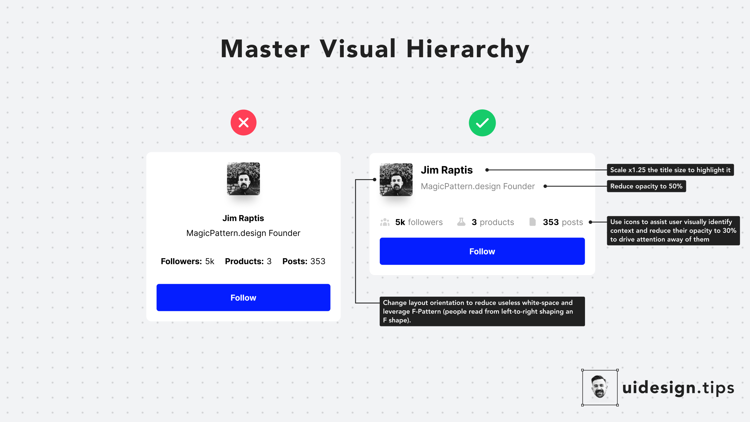
Hack Visual Hierarchy
Hack visual hierarchy with these simple hacks: • Reduce the opacity of secondary info • Use bold font-weight to emphasize • Scale your title's size by a fixed ratio (eg x1.25) • Arrange elements to the left side (for LTR users) • Group together relevant elements
howvisual effecthierarchyuxui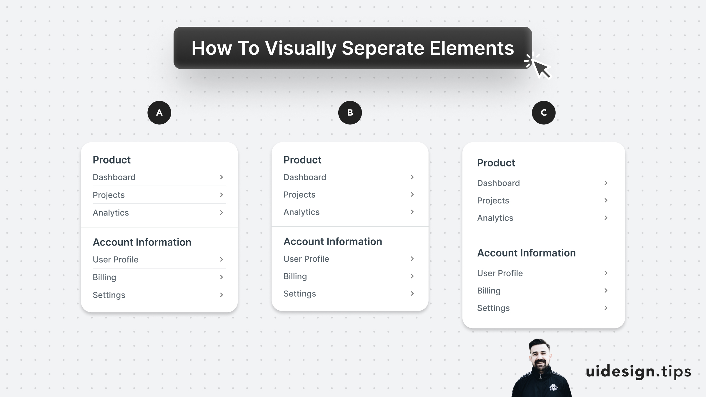
Visually Separate Elements
Prefer to visually separate menu sections with whitespace. Whitespace makes the UI look cleaner and request less cognitive effort from the user. In the example below: - A uses dividers for everything - B uses a divider between sections - C uses only whitespace A is too complex and distracts the user, but both B & C can be used on real-life user interfaces. B puts more attention on differentiating the sections. C makes the UI look cleaner.
visual effecthierarchyuiuxwhitespace
